Resume
In this short tutorial I will show how to create a simple dynamic dashboard with Tableau. To this end I will use the Earthquake data originally sourced from a .csv file from the United States Geological Survey - past 30 days.
Goals
Our prospective client ordered a dashboard with the following requirements:
- In needs a Map showing the location of the Earthquakes, clearly showing their intensity in terms of magnitude.
- It needs a list of the top 10 biggest Earthquakes.
- It needs a breakdown of the percentage of Earthquakes that ocurred in each broad location.
- At a more granular level (more detailed) it needs to show how many Earthquakes took place, their average magnitude, and the maximum magnitude.
- A single data filter is also requested so that it is possible to move the Earthquake data back and forth day by day, manually as well as sequentially.
Deliverables
The first version of our product in its online version is shown below.
Data
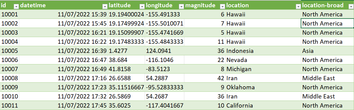
Our data is comprised of 2228 Earthquake events all over the world, from 11/07/2022 to 10/08/2022. It is formatted in the .csv format and has 7 columns: id, datetime, latitude, longitude, Earthquake magnitude, location, and broader location.
The Figure below shows the first 10 rows of the data in Excel.
First, we open Tableau, and then click on File/New or ctrl+N. This commands creates a new Tableau sheet. To import our data, we just click on Data/New Data Source or ctrl+D and then select Text file and then the file itself. This will connect our sheet with the new data. The Tableau window should look like the one below.
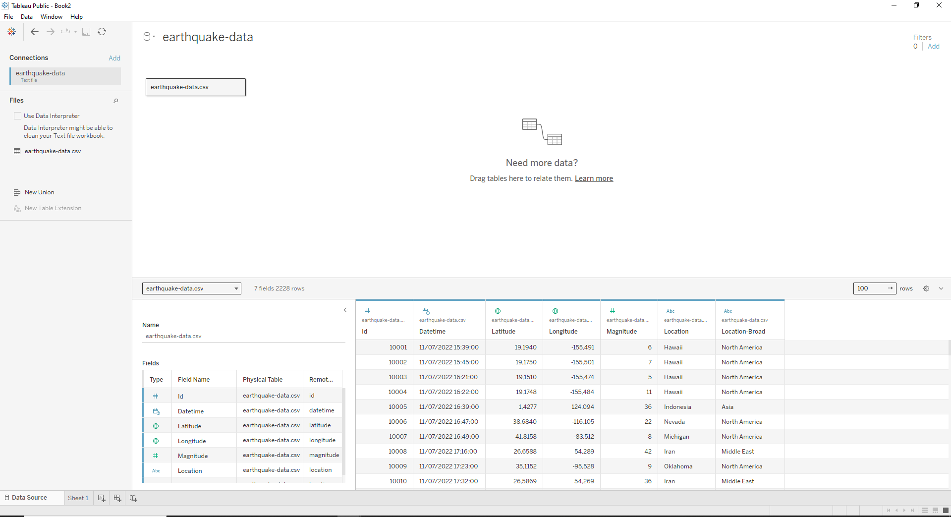
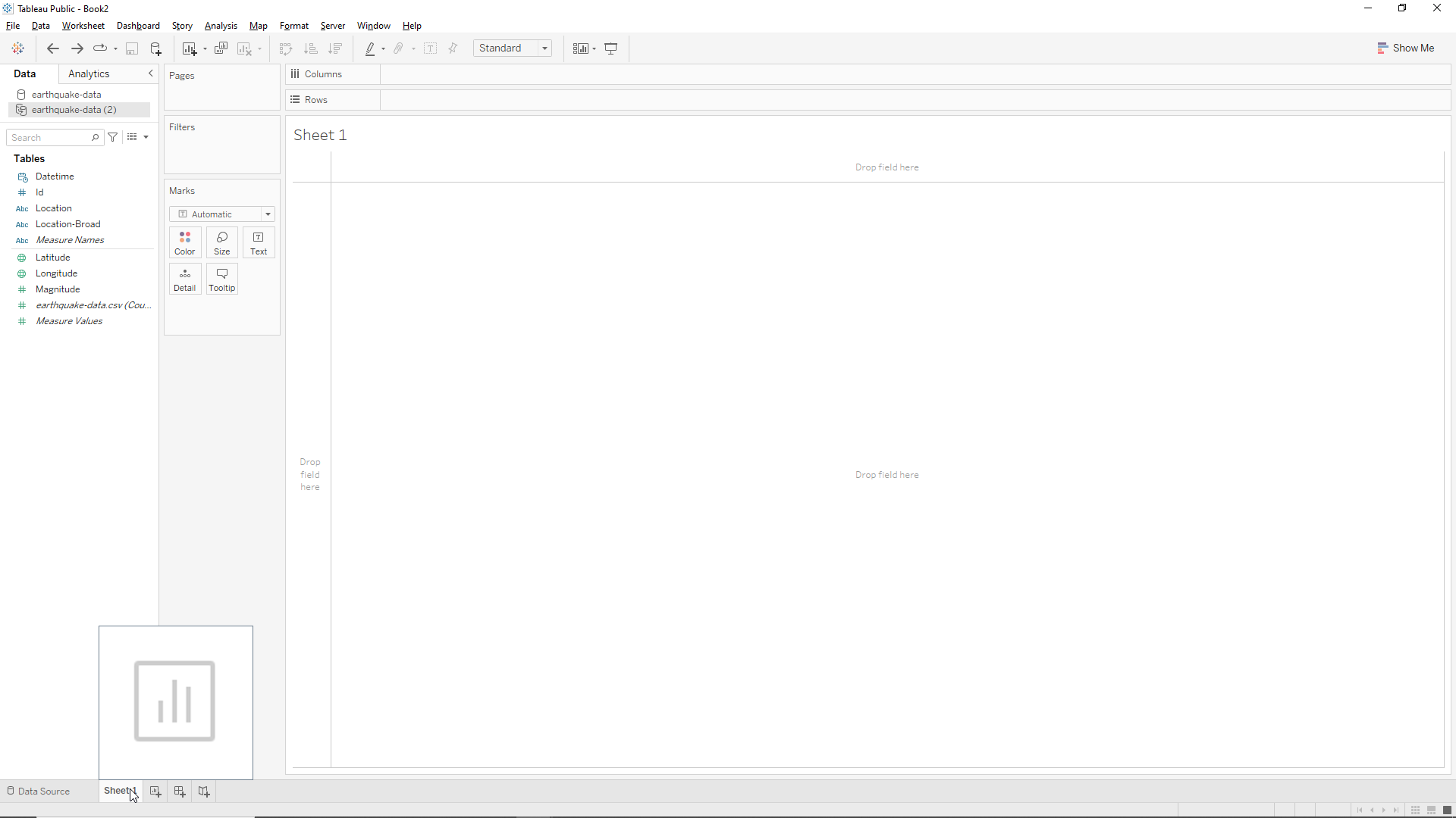
From here we click on Sheet 1 in the bottom left corner, where the mouse pointer is located, to go back to our worksheet. Now we have our data (Tables) in the left hand side of the window as shown below.
Worksheets
First steps
Creating a visualization in Tableau is simple and intuitive. In this case (careful!!) my data is very well prepared, and tableau already identified correctly all columns. Therefore I just need to drag the variables into the drop fields.
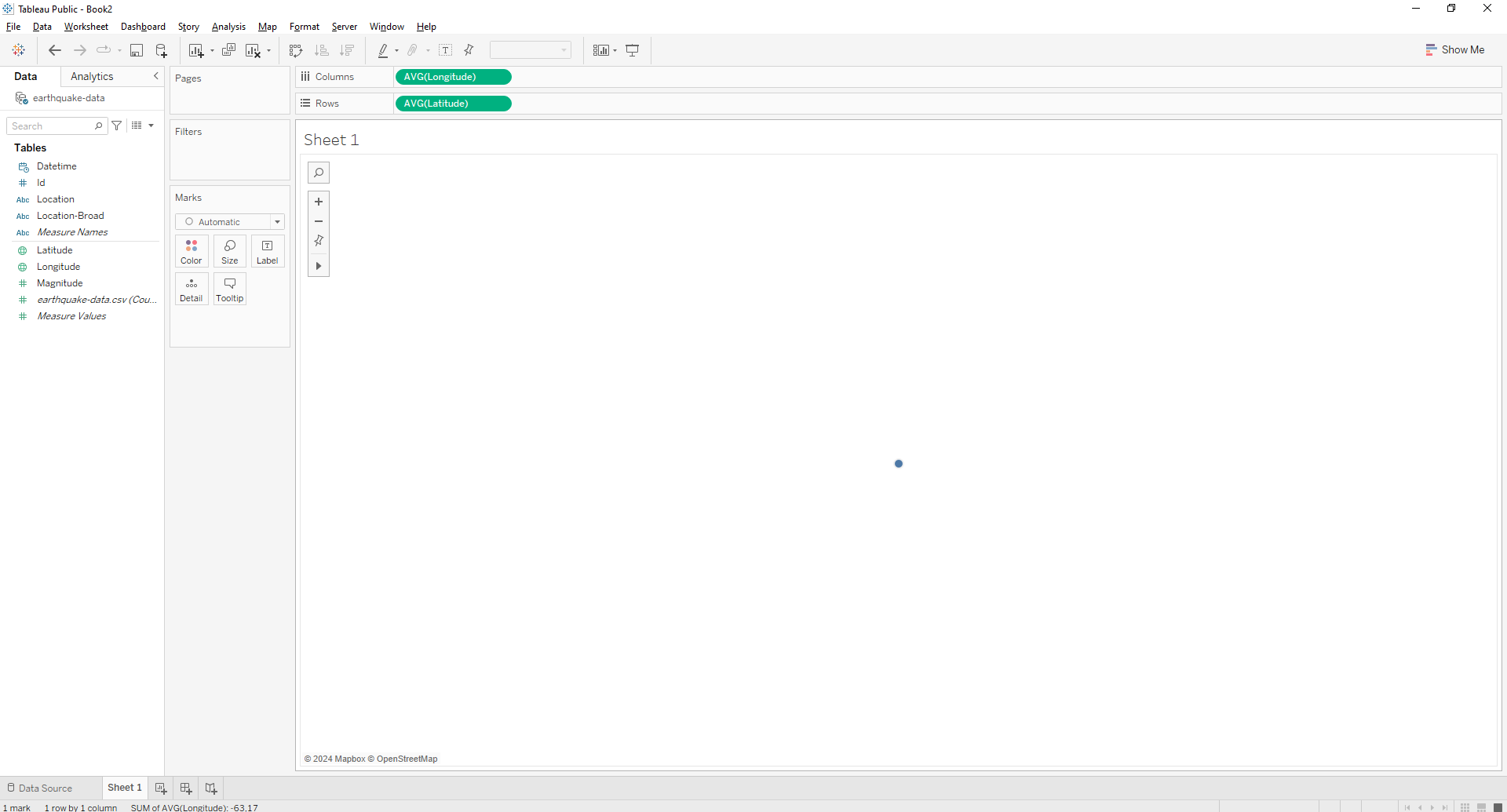
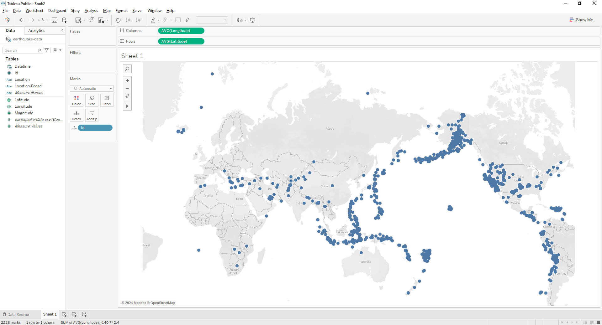
Let’s first drop Latitude and Longitude. You should end up with a blue dot in the middle of the screen, and Longitude as a Column and Latitude as a Row, as shown in the Figure below. If that does not happen, go back and drag Longitude into the Columns field and Latitude in the Rows field instead.
Now, we’ll just drag the Id into the Detail field on the left of the screen (but right of the Id variable). If we do this, voilà we have a nice map with ALL the Earthquakes featured in the table, as shown below!
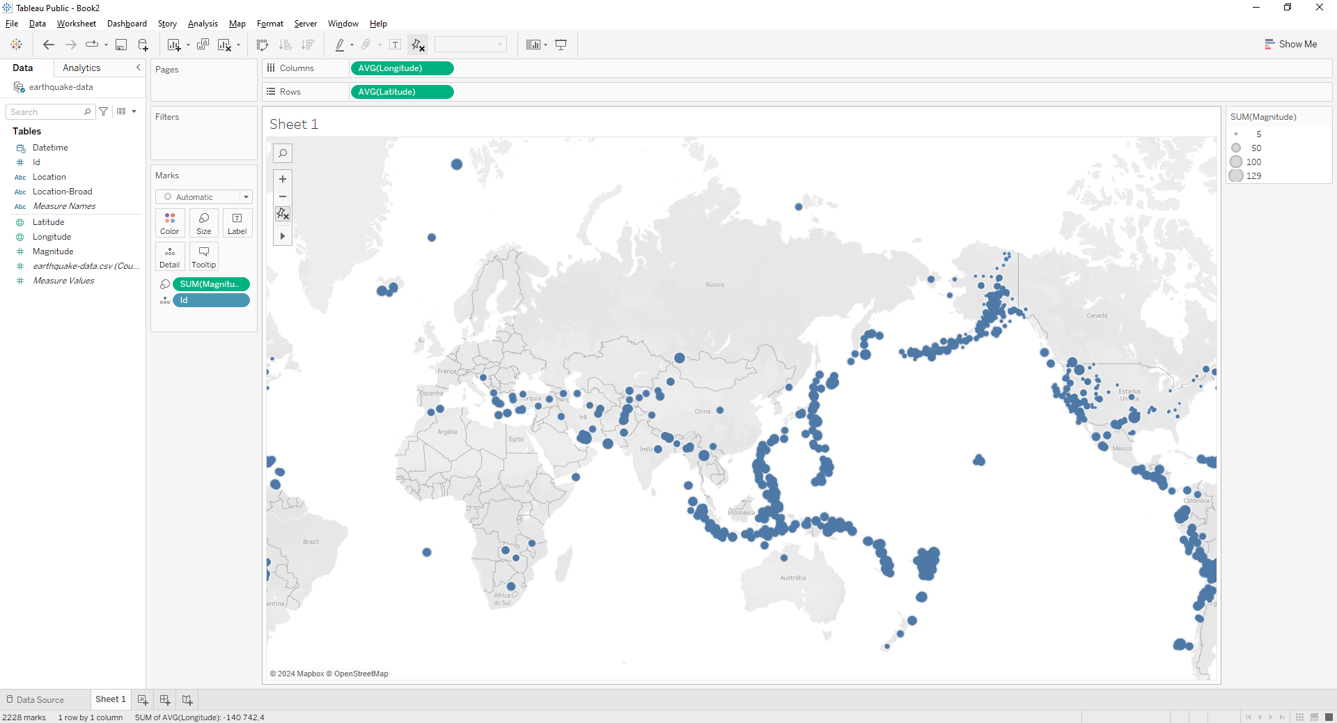
We have the location of the Earthquakes. But how can we visualize their magnitudes? In Tableau is quite simple! We just need to drag the Magnitude variable into the Size field near the Detail field we’ve seen before. The size of the circles in now proportional to the Earthquake’s magnitudes, as shown below.
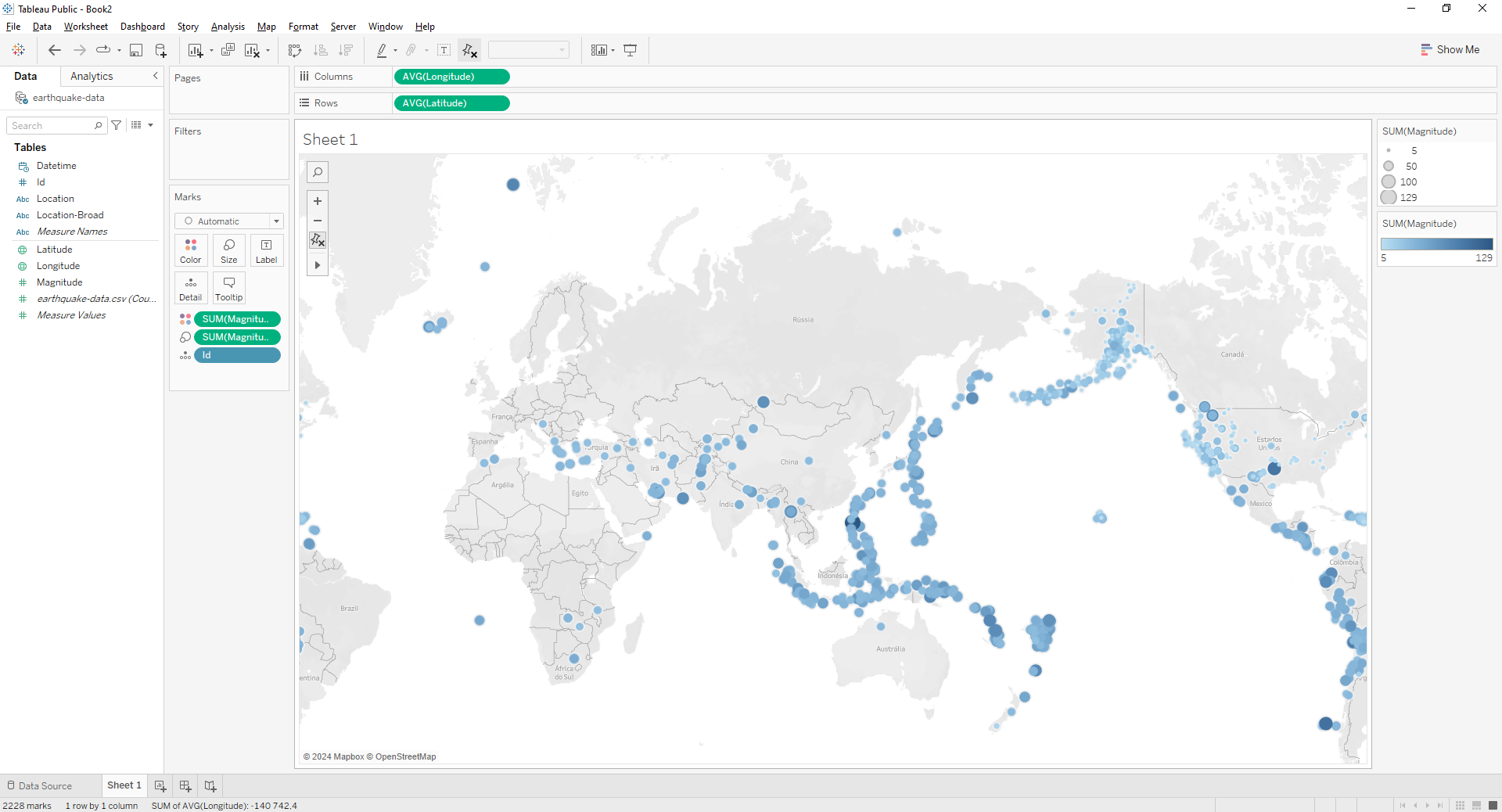
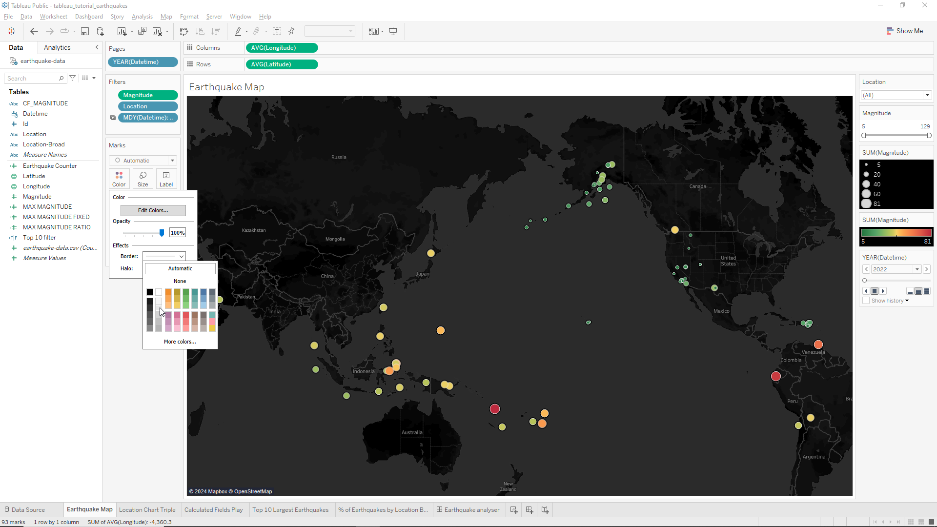
However, the data visualization looks a bit cumbersome. To overcome this we will again drag the Magnitude variable but this time onto the Color field. Again, the visualization improves significantly with the addition of a blue gradient, as shown below. It is also worth noticing the legend in the right hand side of the window for the Magnitude variables.
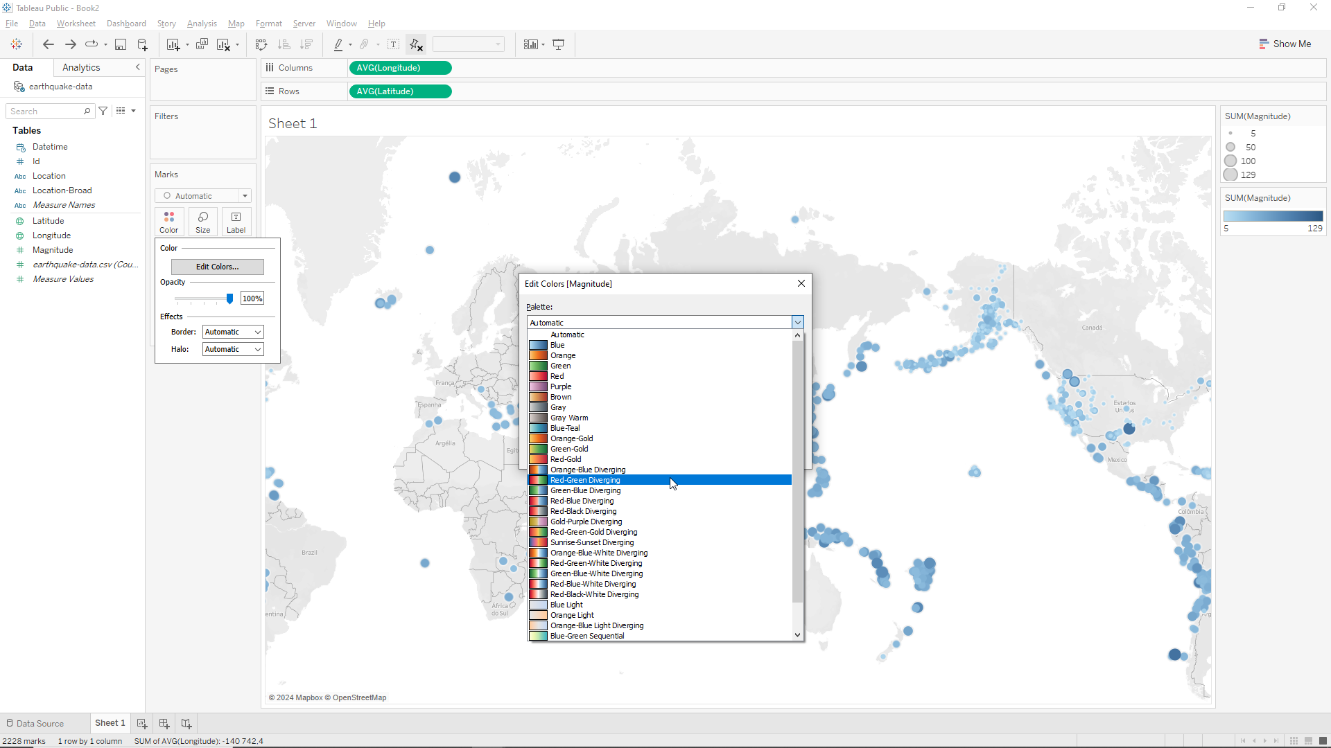
Ok, this looks great! But what about changing the color scheme a bit so that the severity of the Earthquake can be easier to interpret? To do this we can click on the color field again and then on Edit Colors. As shown below our color Palette is on automatic. Let’s change this to Red-Green Diverging.
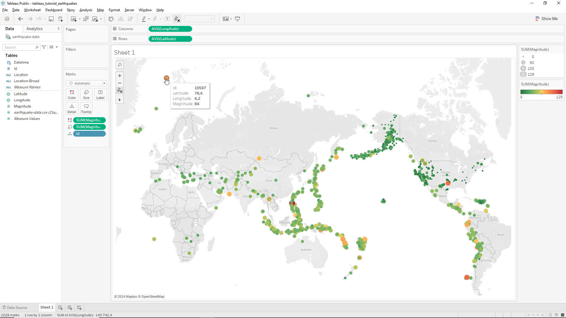
From here we click on the Reversed radio box and click OK. Now we have a map with magnitude dots that range from the weaker Earthquakes, in green, to the stronger Earthquakes, in red! Also if we hover the mouse over a certain point, we’ll get some basic information about the Earthquake, as shown in the /img/earthquake_tracker/image below as well.
Adding filters
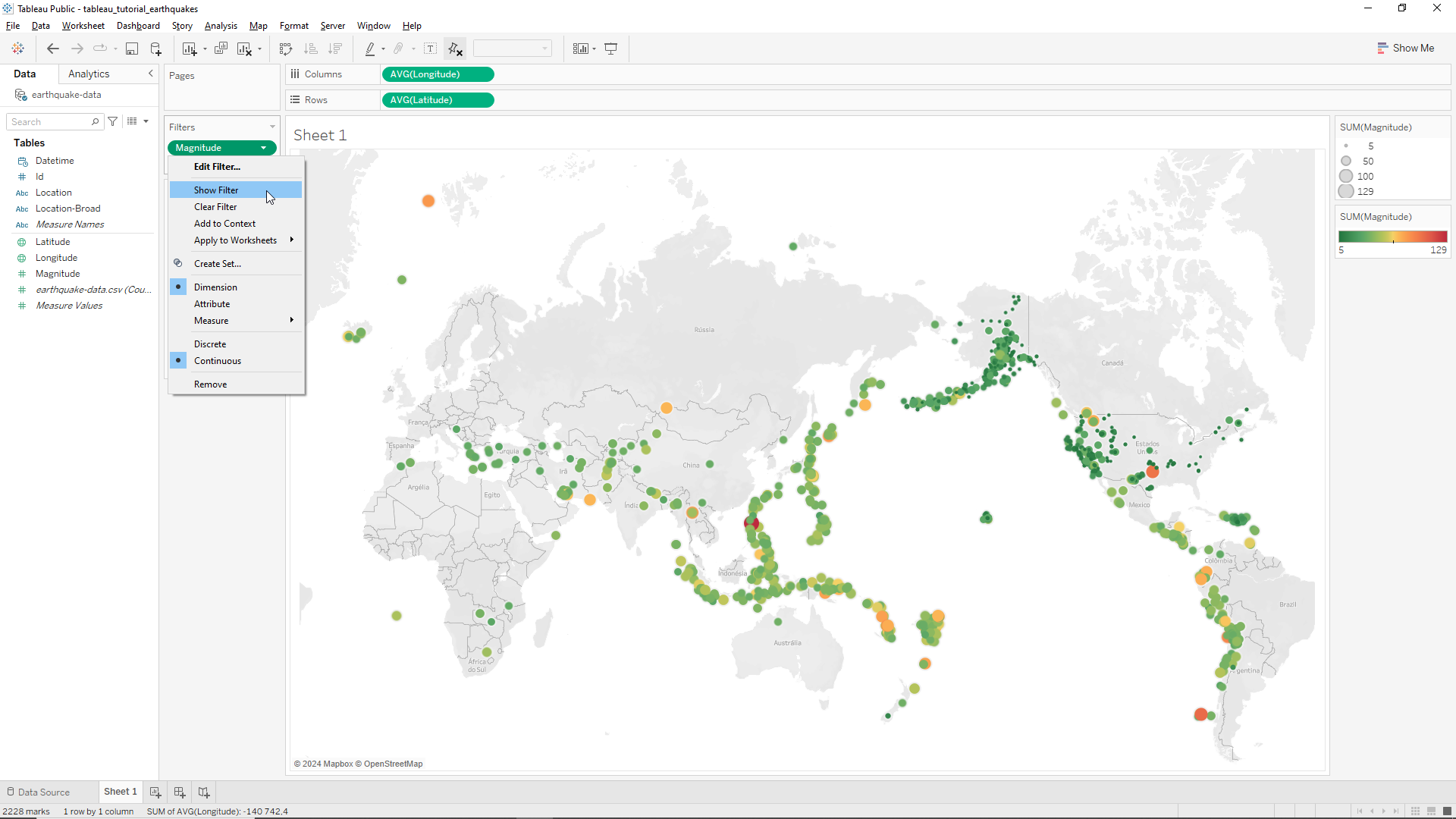
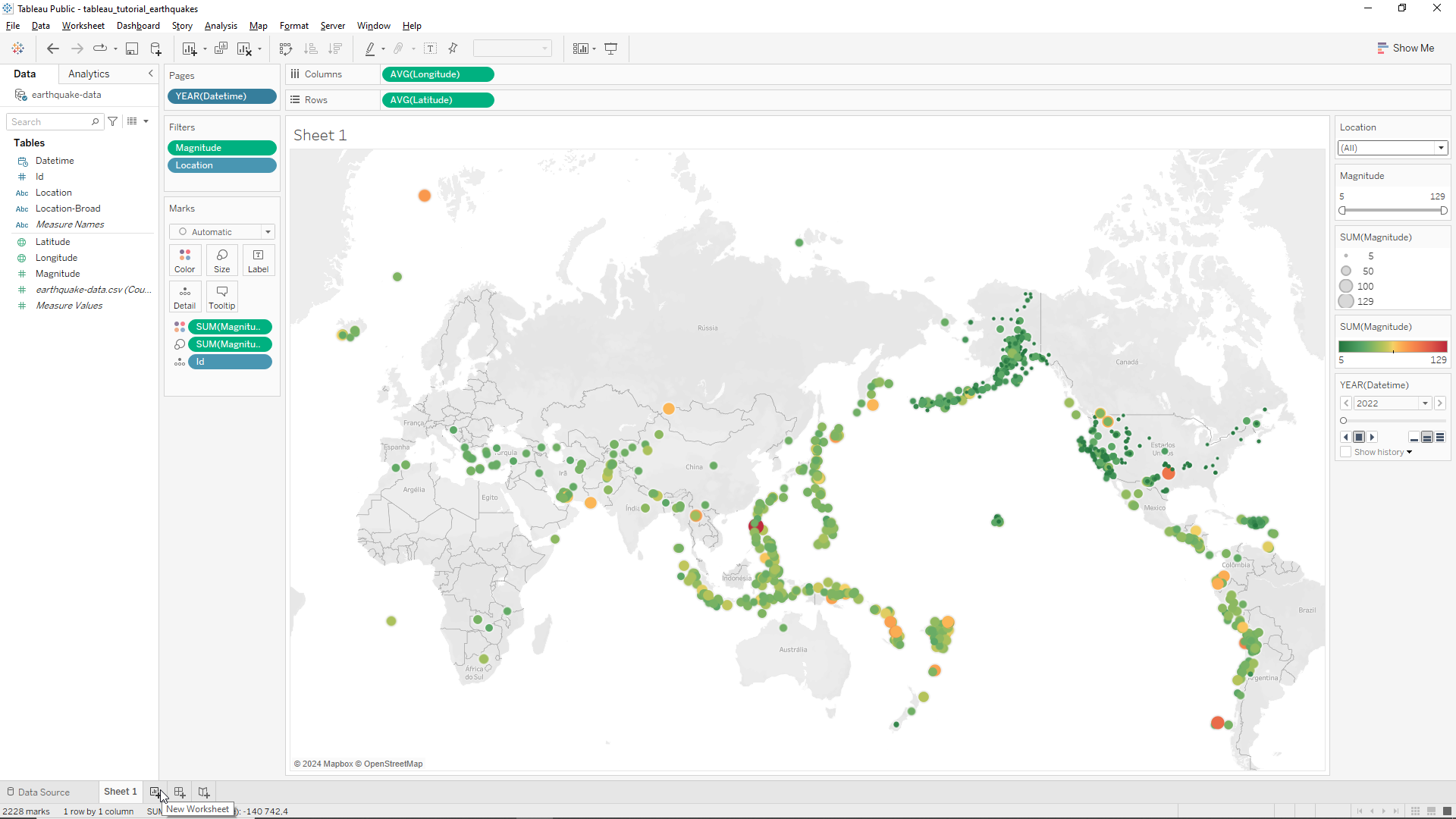
Let’s now add a magnitude filter to our visualization. To this end we’ll drag the Magnitude variable to the Filters field on the right of the variables and on the top of Marks field. Then we click on All Values, then Next and finally OK. From here we click on the snippet of the Magnitude filter (it’s on the right) and click on Show Filter as depicted in the Picture below.
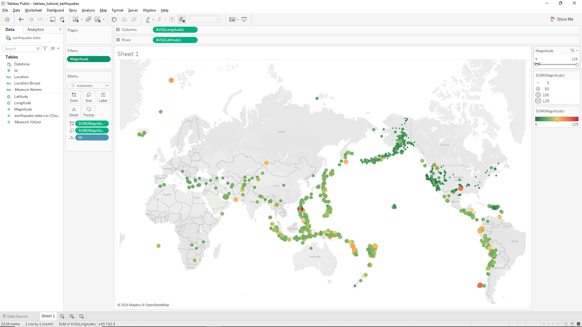
This will add a new filter slider on the right hand side of the window as shown below. We can now move the upper and lower limit of this slider to filter the magnitude values of the Earthquakes!
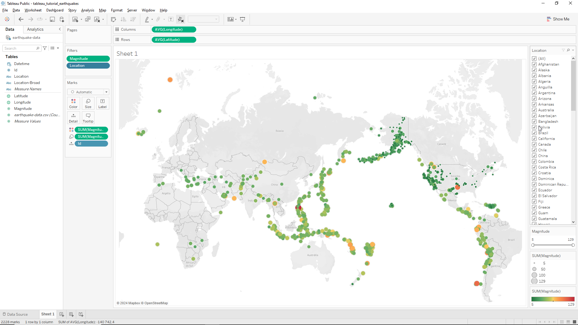
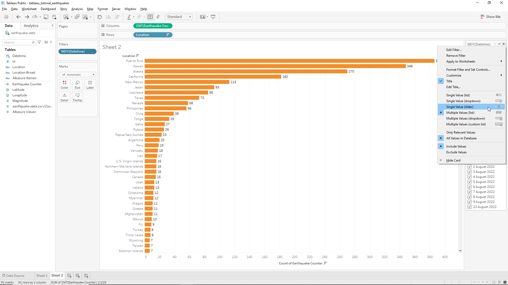
We also want to add a location filter which can be quite handy if we want to select certain countries or regions. To do this we just need to drag the Location variable to the Filters field, click on All button and then OK. As we’ve done before we now go to the Location variable in the filters field and click on the snippet and then click on Show filter. The full list of the countries will now appear on the right hand side of the window as shown below.
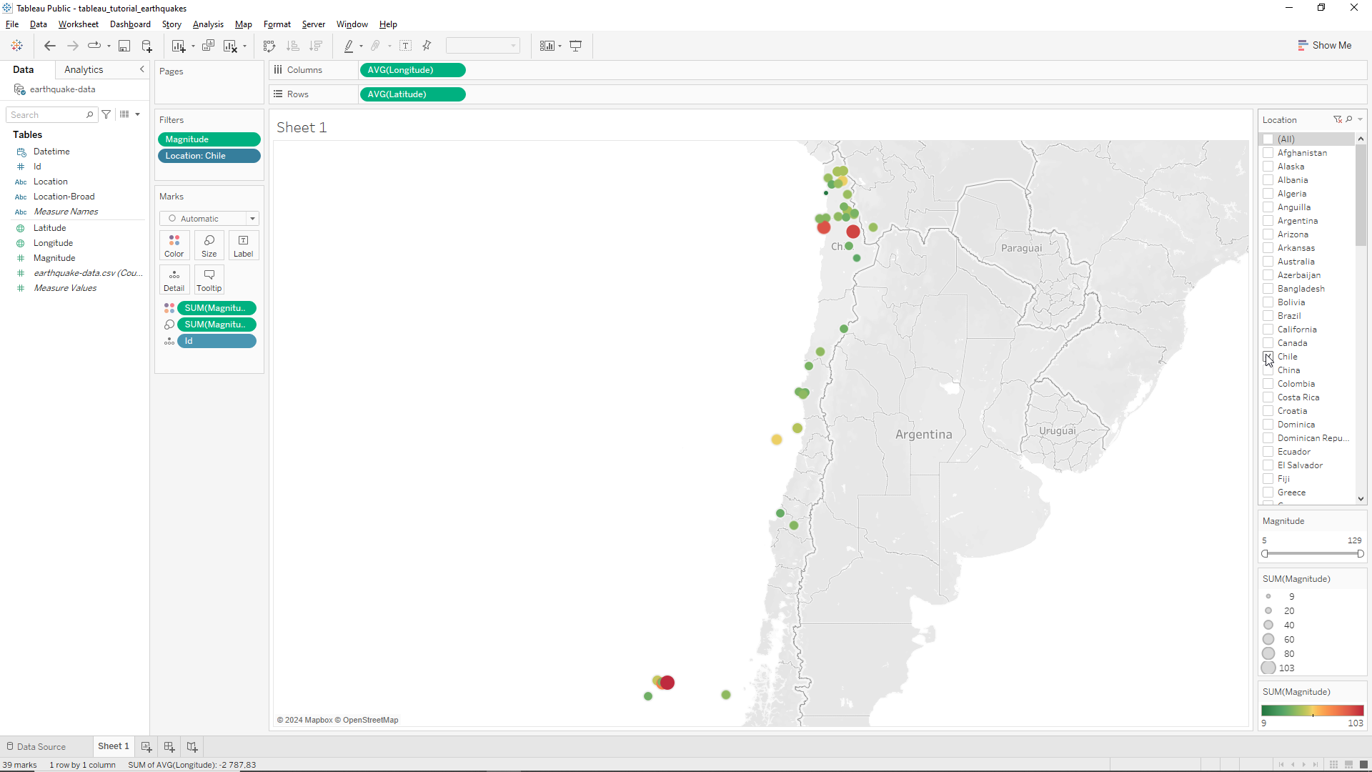
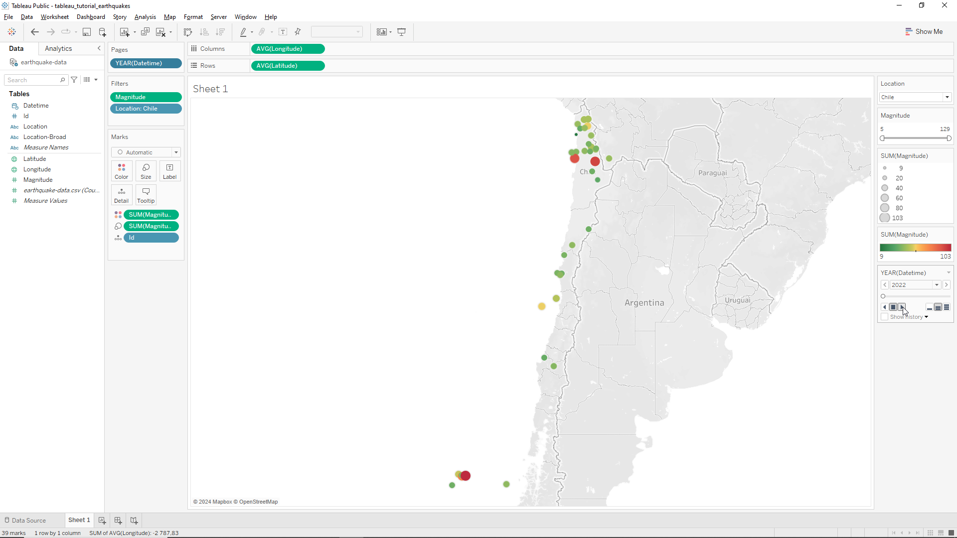
We could now, for instance, click on (All) to deselect everything and then click on Chile and the map automatically zooms to Chile in South America showing a detailed map of this incredibly shaky country as shown below.
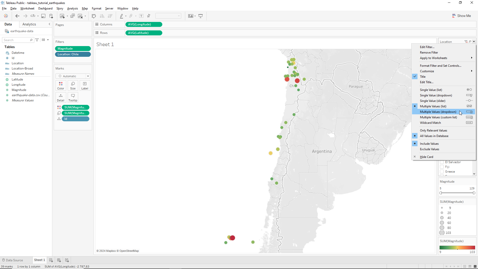
The explicit listing of the countries on the right of the screen looks too clumsy. To change this and create a lighter aesthetic we click on the drop down menu on the right hand side of the Location menu, as shown in the Figure below and then select Multiple Values (dropdown).
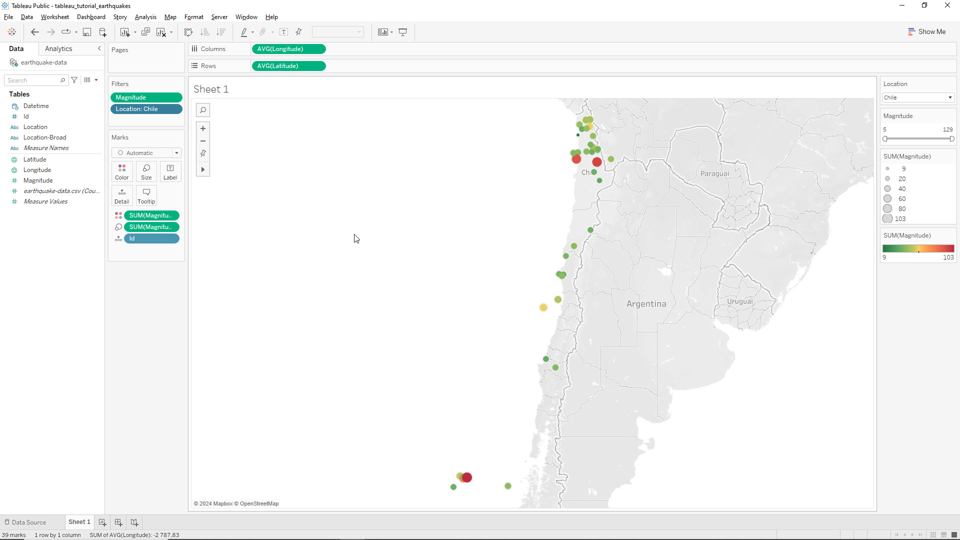
We now have the same map but with a much lighter legend on the right hand side of the window as shown below.
Pages
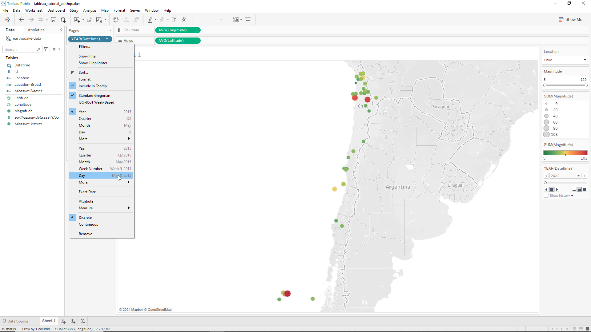
Pages is a very useful tool in Tableau that allows us to dynamically alter our map or plot. In our specific application we want to see how the Earthquakes change with time. To this end we will drag the Datetime variable onto the Pages field, located just on top of the Filters field.
Tableau will automatically assume that we want our data values sorted by year. However we want it by day. Therefore we click on the dropdown menu of the Datetime variable in the Pages field and select the day format where the mouse is located as shown in the Figure below.
We now have a map showing the information of the World’s Earthquakes that took place only on the 11th July 2022, as detailed on the DAY legend located at the right hand side of the windows, as shown in the Figure below. We can now show the day-to-day changes in Earthquake occurrence, as well as playing them sequentially.
Creating new Worksheets
In order to organize our work and advance towards our final data dashboard we need to create other data visualizations so that we can then aggregate them. In order to do this we will click on the + sign locate at the bottom left of the screen, as shown below.
When clicked it will create a new worksheet. In this new sheet we will drag our Location variable to the Row field of the sheet or to the Rows field on the top of the window. The result is the same.
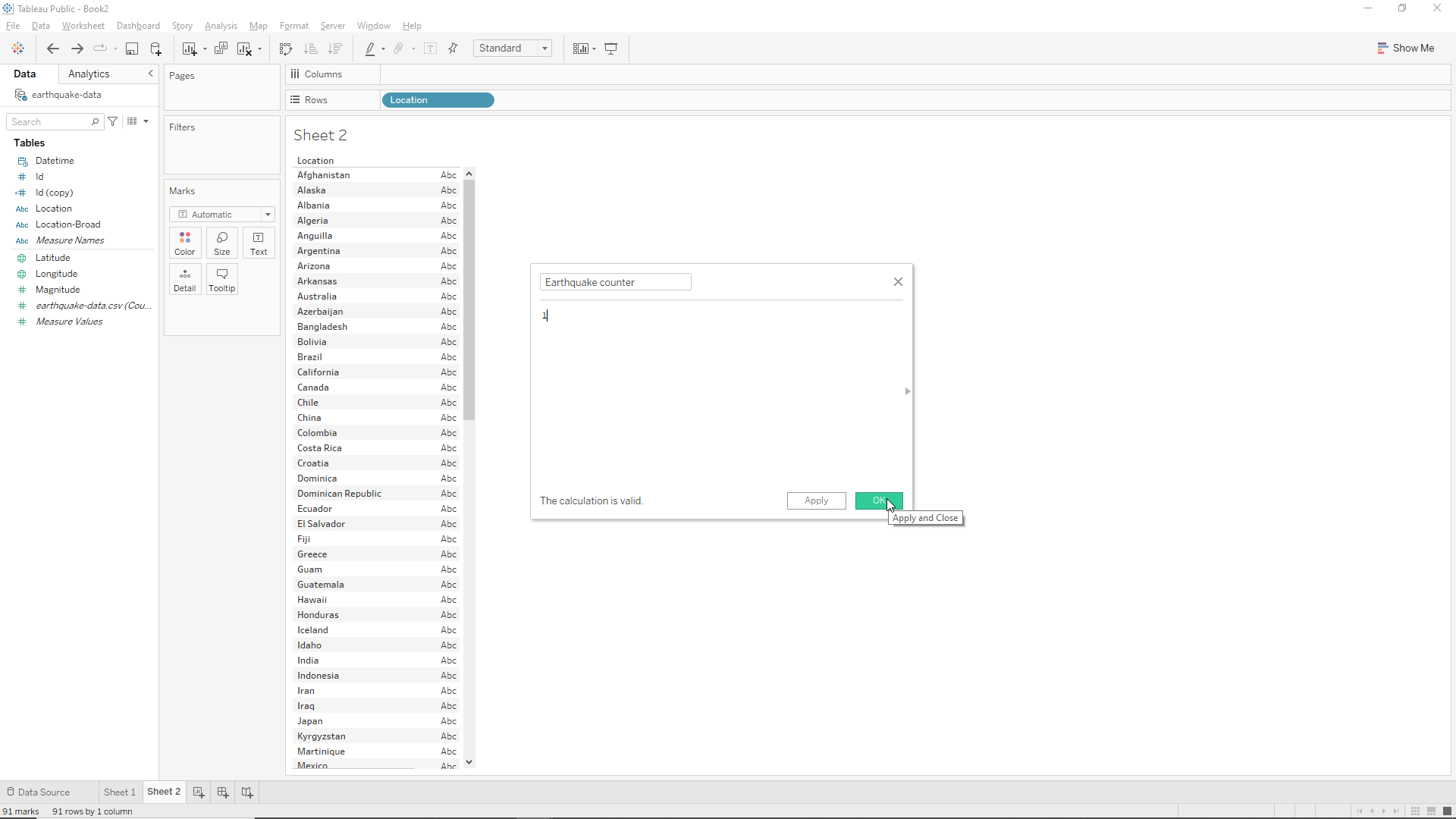
Now we want to know how many Earthquakes we have by country. To do this we need to count the number of Earthquakes. To do this we will create a new variable by right clicking on the bottom of the Tables field (left hand side of the screen) and then Create Calculated Field as shown below.

Let’s call it Earthquake Counter, and add a 1 only, and click OK as shown below.
Now we just need to drag this new variable onto the right of the Location variable in Sheet 2, where the Abc letters are located. When we do this we obtain a count of the Earthquakes by location as shown below.
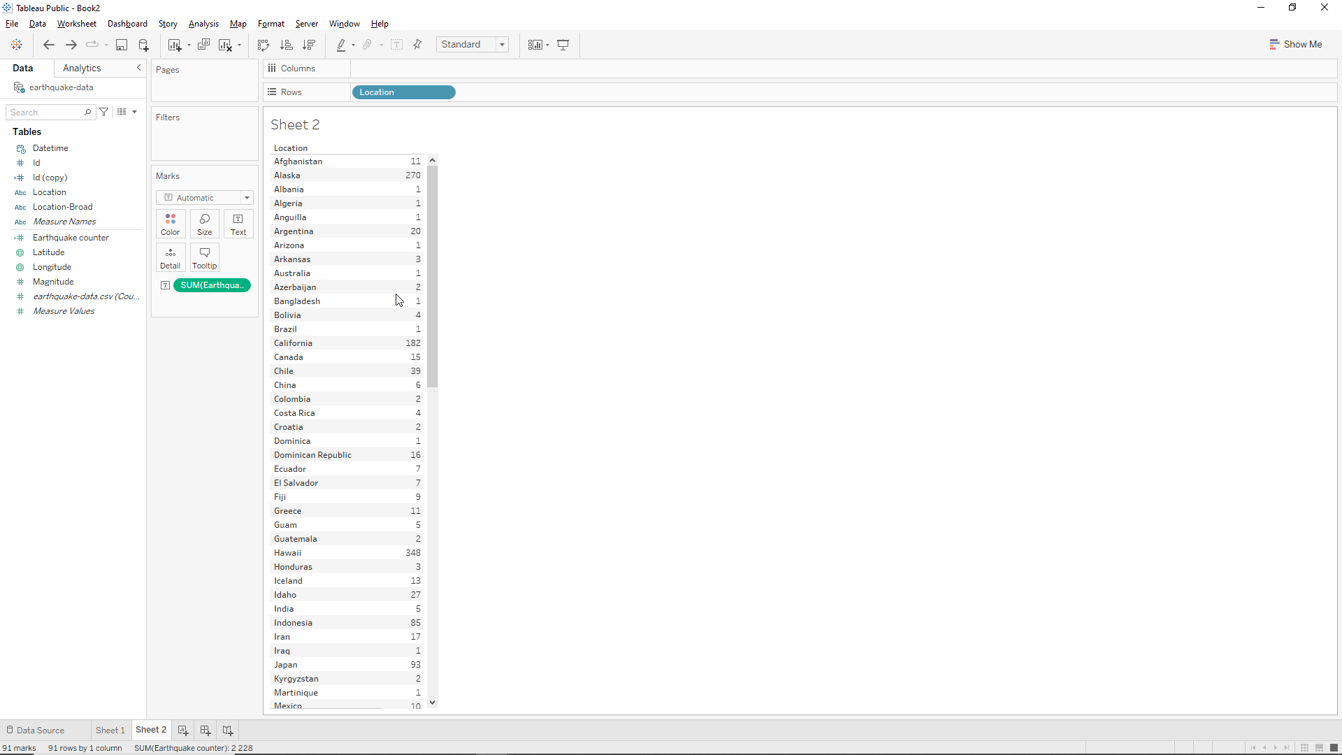
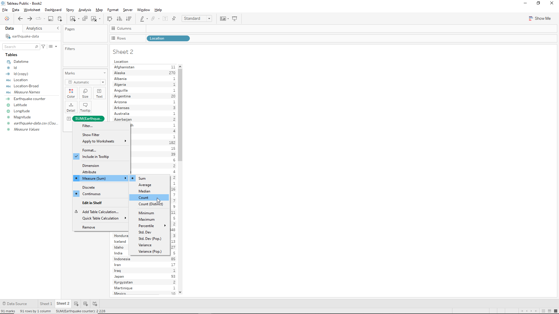
We note however that Tableau made an incorrect assumption regarding what we want to do: it assumed that we wanted to sum values instead of counting. As we are using a function of 1 the count will have the same value as the sum but if this was not the case we would get an incorrect answer. Therefore we should change the variable in the Marks field from SUM to CNT as shown below (Measure/Count).
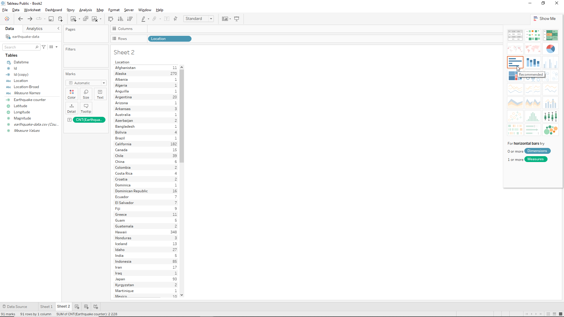
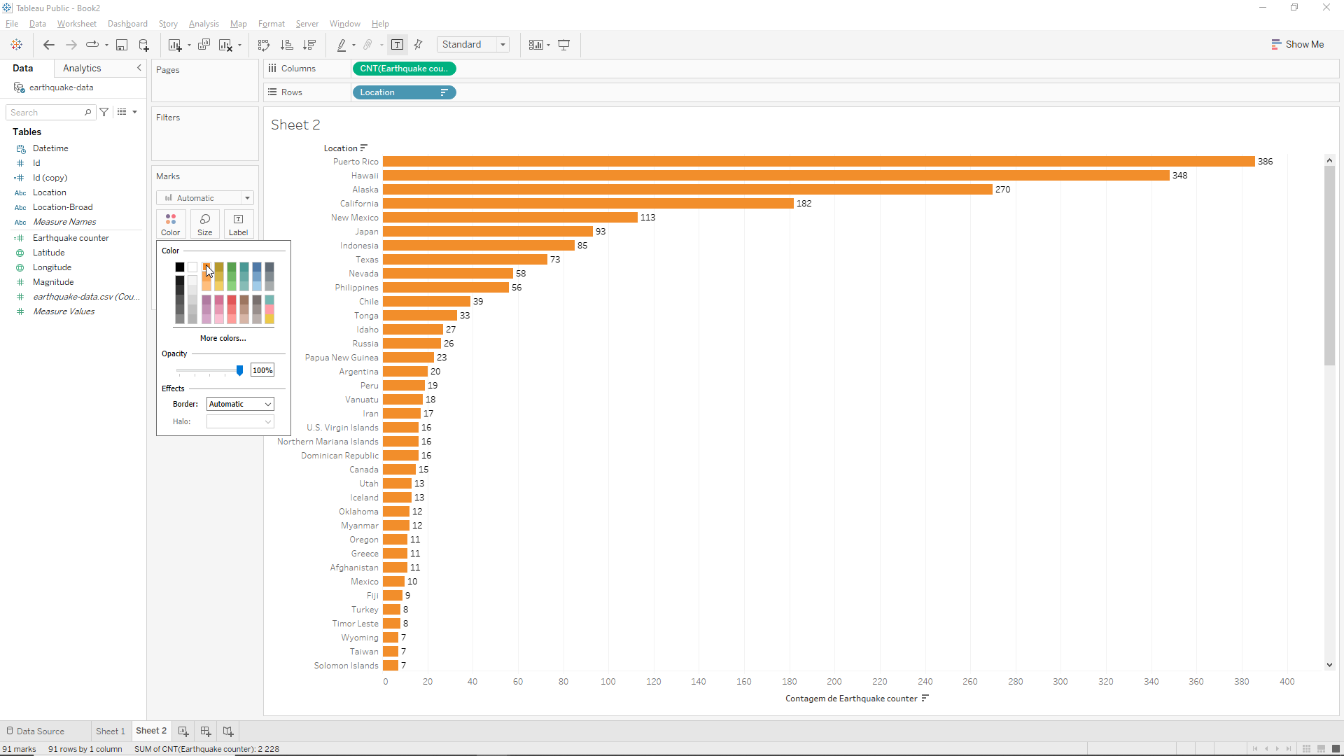
Now we want to visualize our data not in a table but in a bar chart. In Tableau this is straightforward. We just need to select the Show Me button on the top right hand of the window and then click on horizontal bar chart as shown below.
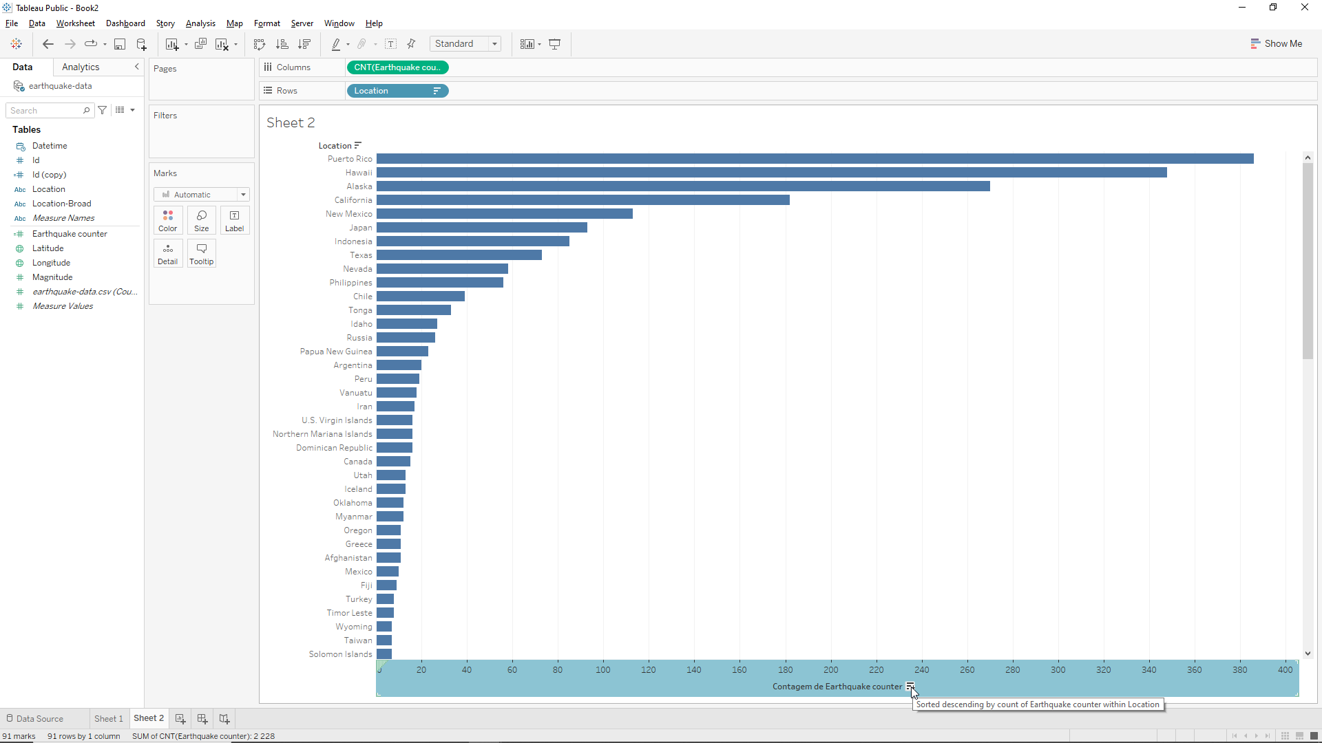
The bar chart will sort the location by alphabetical order but we want to sort by number of Earthquakes. To do this we head down to the bottom of the window and click on Contagem de Earthquake Counter (should be Count of… but for some reason this is in Portuguese!). Et voilà we have our bar chart sorted by the number of Earthquakes as shown below.
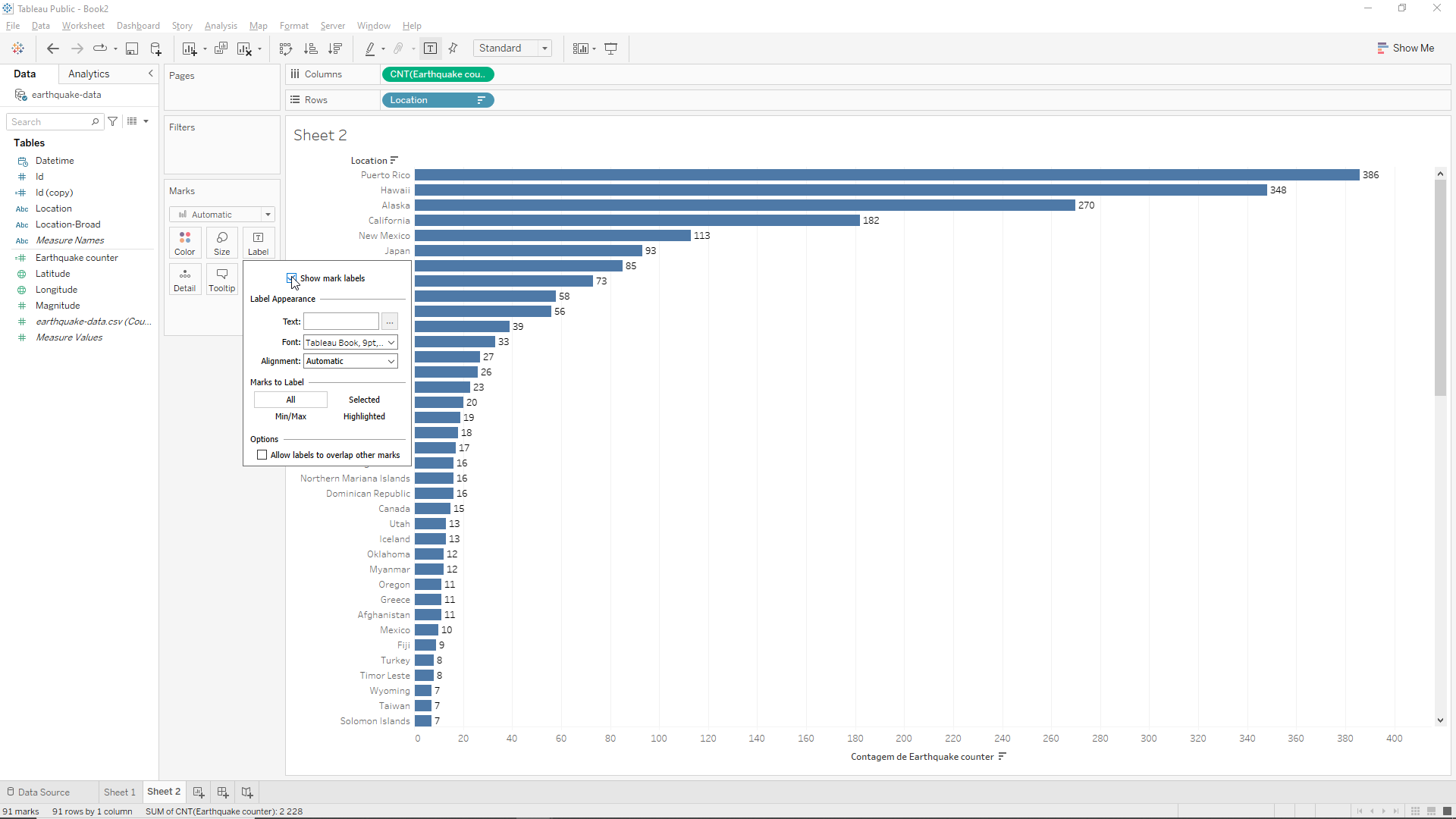
To add some detail into our visualization and help our prospective client we can show the number of Earthquakes at each location explicitly. To do this we go to Label on the Marks field and select the Show mark labels box as shown below.
Let’s now change the color of the bars. To do this we just need to go again to the Marks field and click on Color. Then we can select, for instance, orange.
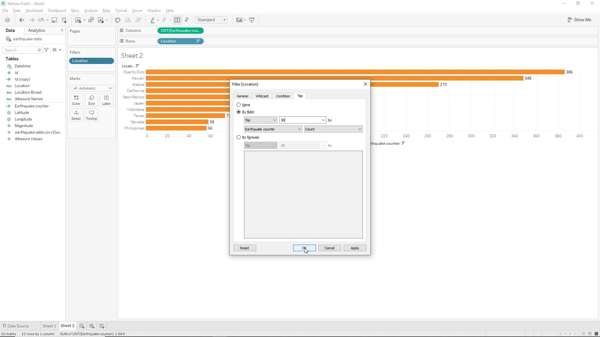
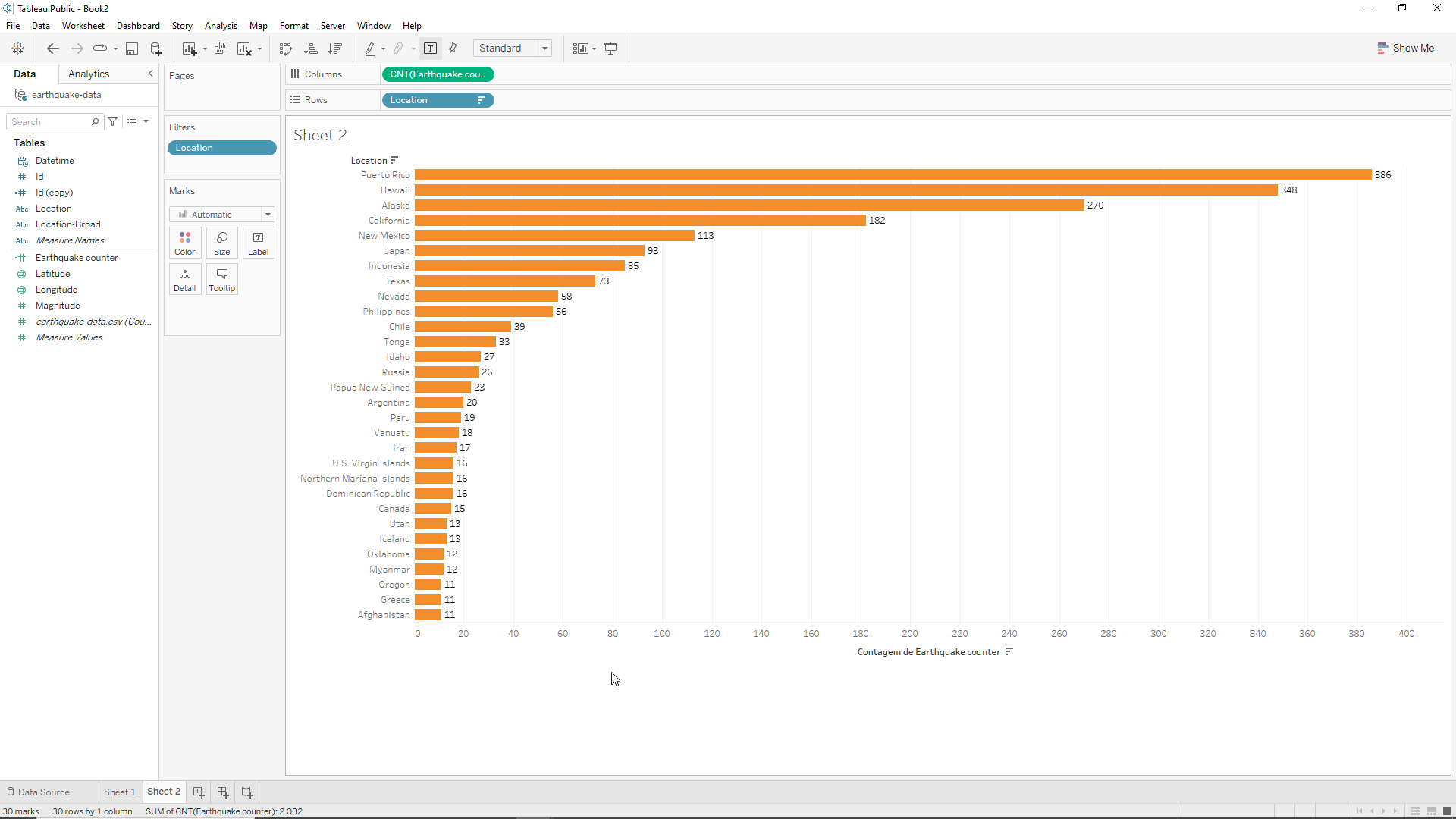
We can also add a filter to the bar chart. Let’s drag the Location variable into the Filters field. A pop-up menu appears and we click on Top. We click on the By field button and then we replace 10 by 30. This will filter the 30 most powerful Earthquakes. Finally we click OK.
We obtain the following bar chart.
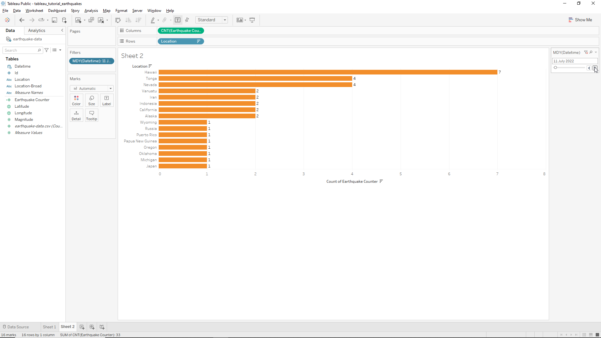
Let’s remove this filter for now. To do this just drag the Location variable out of the Filters field. We know that the stakeholders want to visualize the day-to-day Earthquake change so we will drag the Datetime variable into the Filters field. A pop-up menu appears. Select Month/Day/Year and click on Next. Then click All and OK.
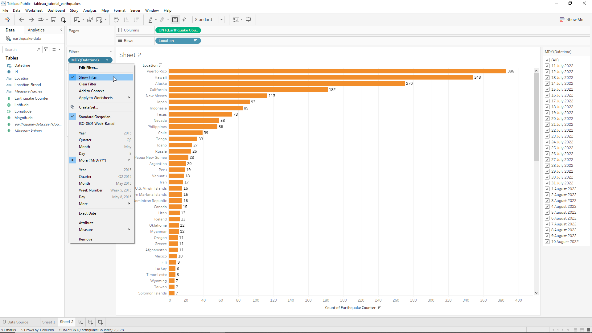
Now we go to the Datetime variable in the Filters field, click on the drop-down menu, and select Show Filter. The dates will appear on the right hand side of the screen. Again, this looks cumbersome so we click on the drop-down menu of the datetime legend and then click on Single Value (slider).
We can now move back and forth in time as shown below. We can also visualize all the data at once by going all the way to the left using the slider left button.
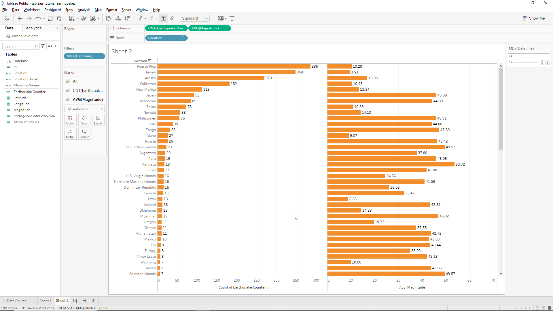
We don’t need only the Earthquake number by location however so we’re going to create two more bar charts in the same worksheet. The first new bar chart will be the Earthquake magnitude by location. To do this we just need to drag the Magnitude variable to the Columns field on the top of the window. We now obtain two bar charts one next to the other. However, we notice that Tableau is summing the magnitude values by location. We want, instead the average. To do this we click on the drop-down menu of the Magnitude variable on the Columns field and click on Measure/Average as shown below.
We obtain the following chart, where we can, at the same time, view the number of Earthquakes at a certain location and know the average magnitude of the same Earthquakes!
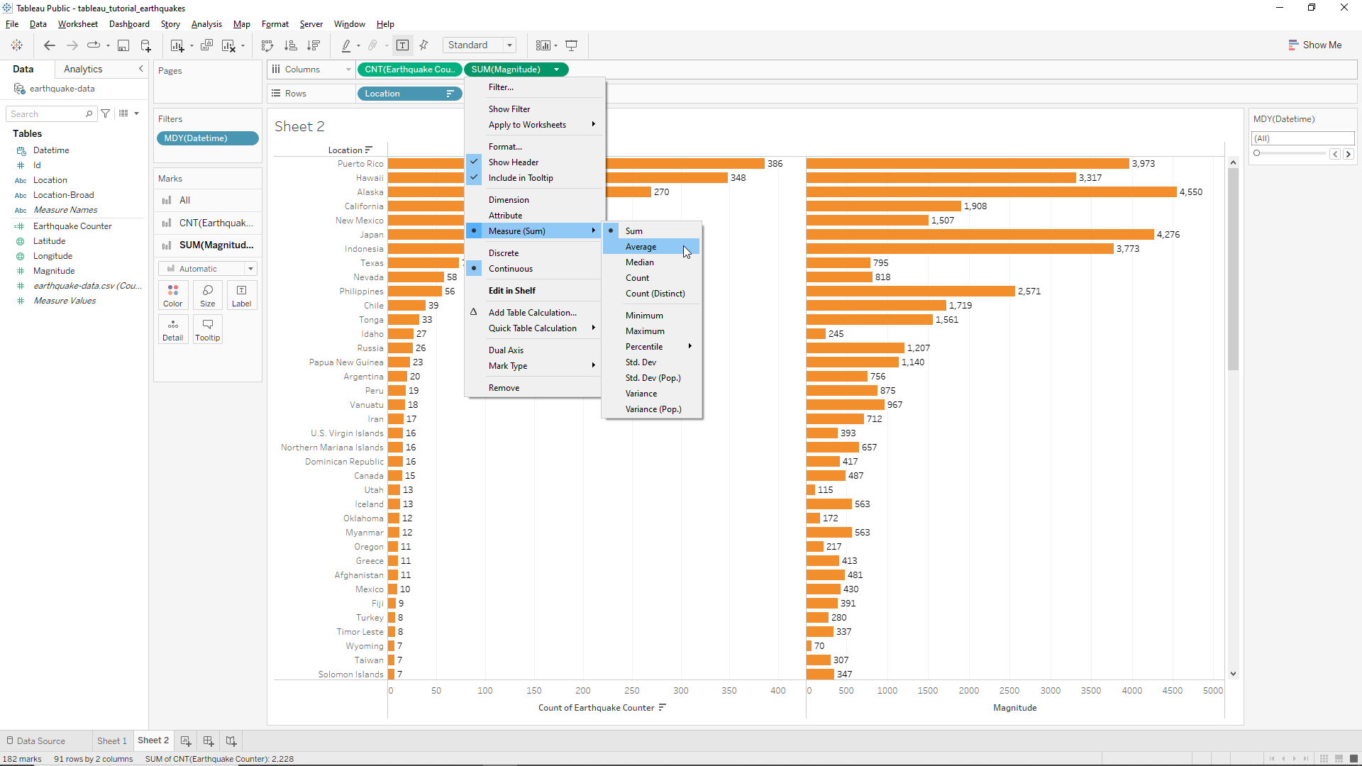
We also know that our client is interested in the maximum magnitude by location. To add this information to our chart we just need to drag again the Magnitude variable to the Columns field. This will open a third bar chart on the right. From here, we go to the same Magnitude variable we’ve just dropped in the Columns field and in its drop-down menu we choose Measure/Maximum. The end result is shown below.
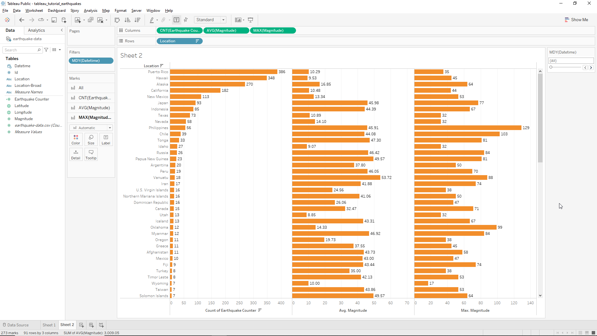
We can now learn, at a glance, the number of earthquakes and its average & maximum magnitude at each location!
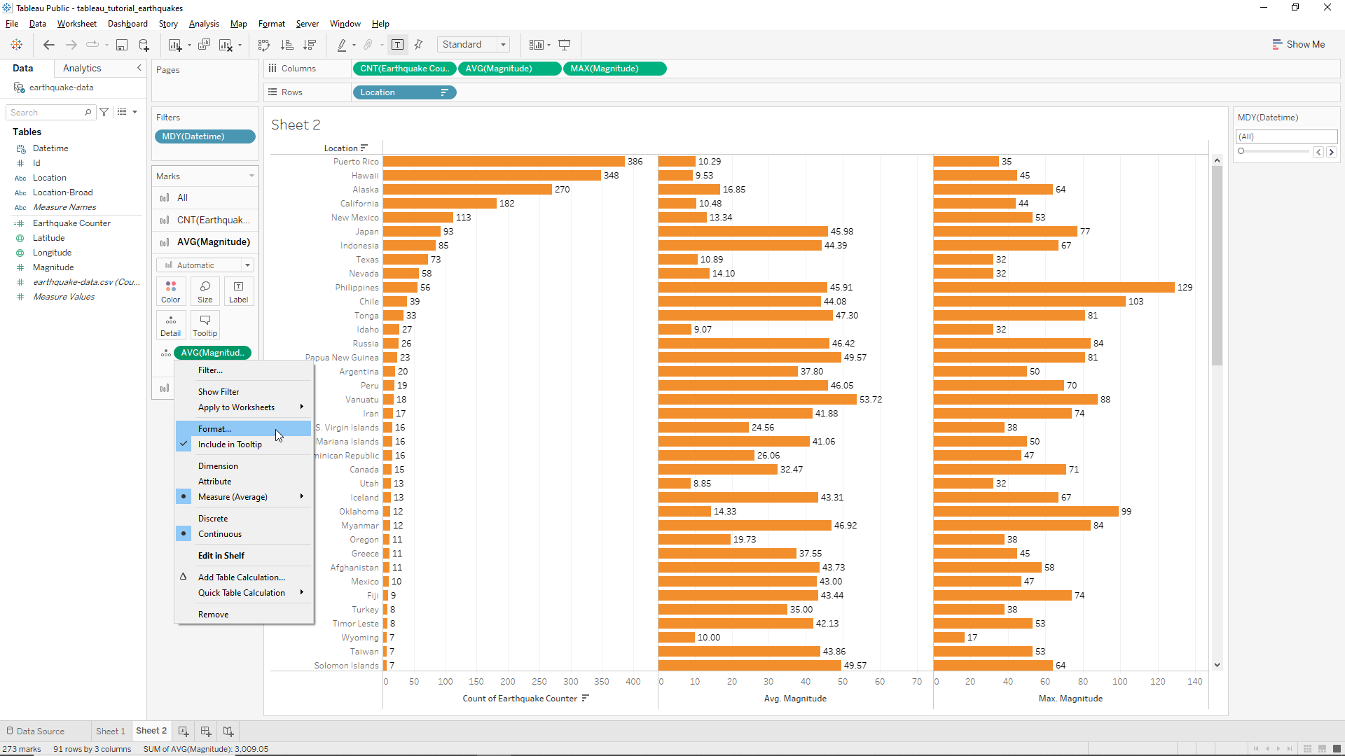
To add some consistency we can change the average magnitude to whole numbers. To do this we select the AVG (Magnitude) box in the Marks field. Then we drag the AVG (Magnitude) variable from the Columns field into this box with the CTRL button pressed so it can COPY the variable and NOT move it. Next, we click on the drop-down menu and then click on Format... as shown below.
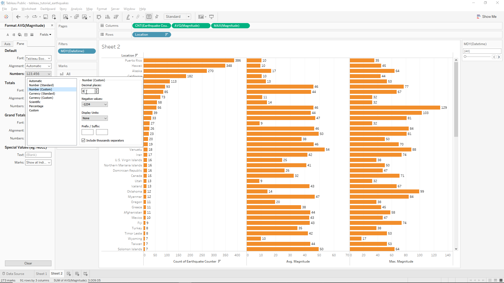
In the Format AVG (Magnitude) box, select Pane, then click on Default/Numbers/Number (custom) and change the decimal places from 2 to 0 as shown below. Now we have our three bar charts with integer numbers only.
Calculated fields
In the case of the magnitude count we did a very basic calculated field. We will need to use a little more logic however as our client needs two categorical variables to distinguish between different Earthquakes: ‘small’ and ‘big’. This will be operated in the Magnitude variable.
To do this we start by adding a new Worksheet. We drag the Id variable onto the worksheet and then the magnitude as well. As before, we can create a new calculated field by right clicking at the bottom of the Tables field, on the left of the window. We name this new calculated field CF_MAGNITUDE. Under the name we can write formulas and most of the work is done by Tableau itself by using autocomplete. For instance, if we write mag, the variable Magnitude will appear as shown below.
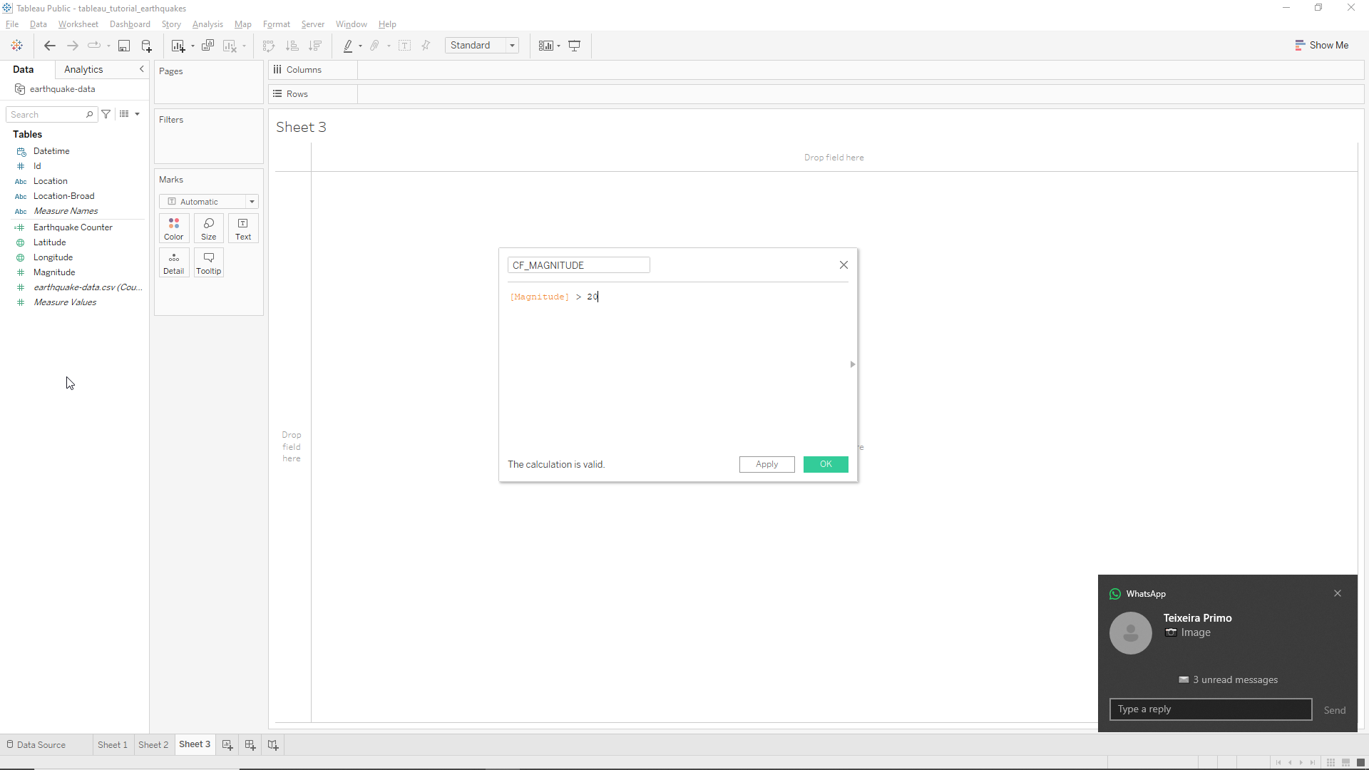
We can start by writing
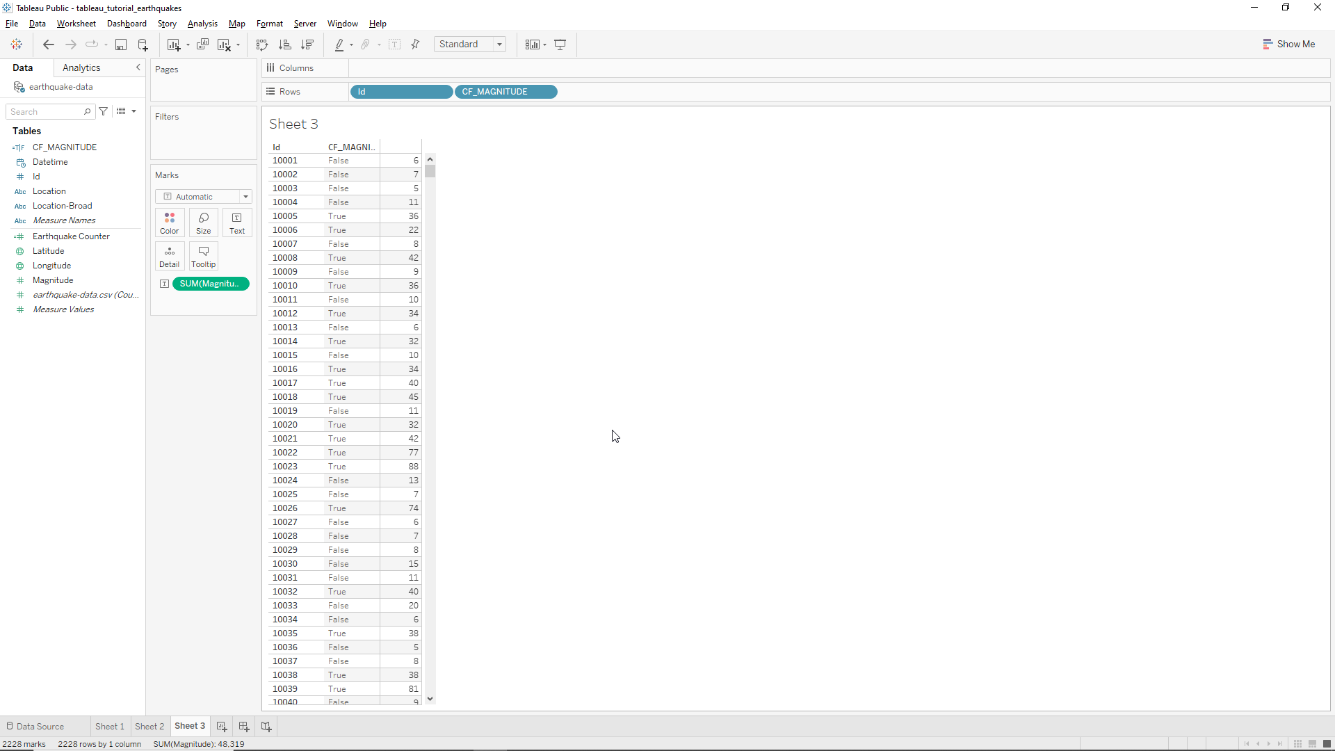
# Magnitude > 20.
This will create a calculated field which will output boolean values relative to the stated condition. The new variable will be located at the Tables field. If we drag the new variable to the Worksheet between the two existing columns we will obtain the following result. We can observe that when the magnitude is greater than 20 the calculated field value is true and in the opposite case it is false, as expected.
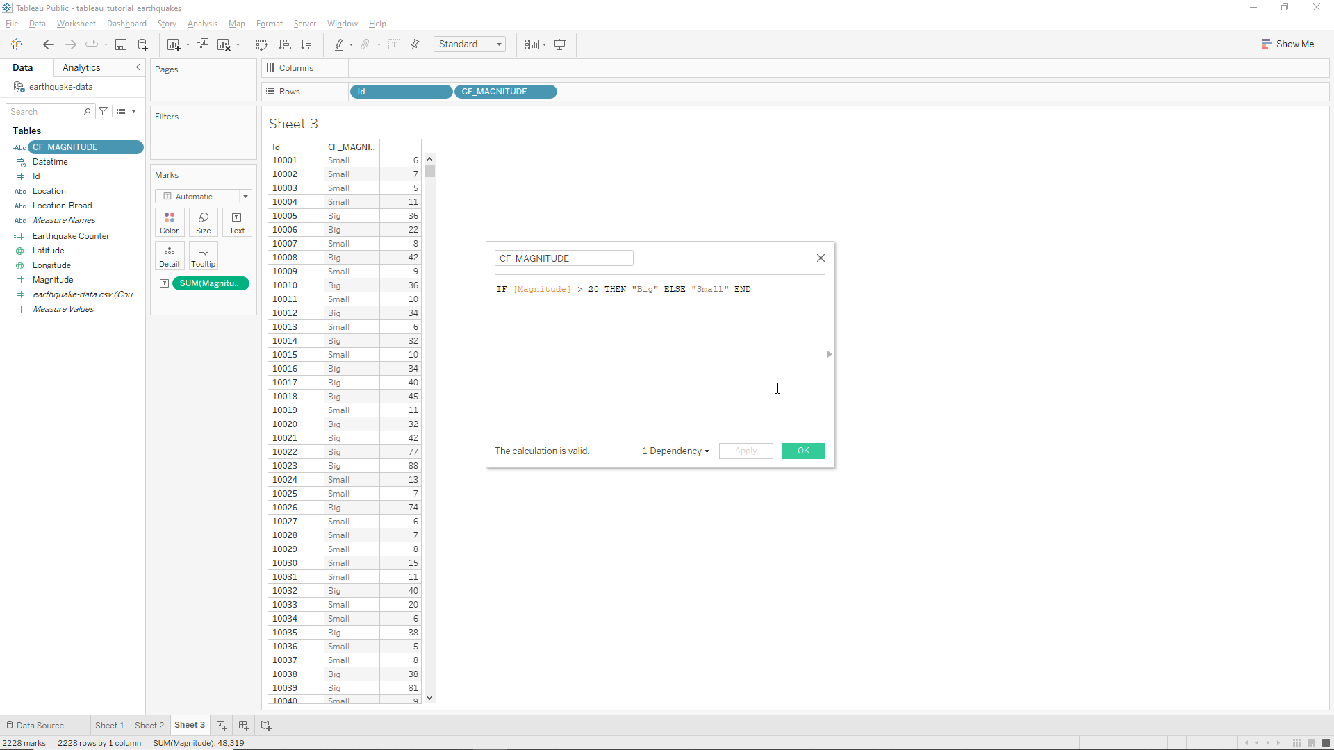
Let’s now add some more logic. First we click on the drop-down menu of the calculated field variable on the left and click on Edit.... Now we can write with autocomplete the following code
IF [Magnitude] > 20 THEN "Big" ELSE "Small" END
This will change the TRUE/FALSE booleans to Big/Small string values as shown below.
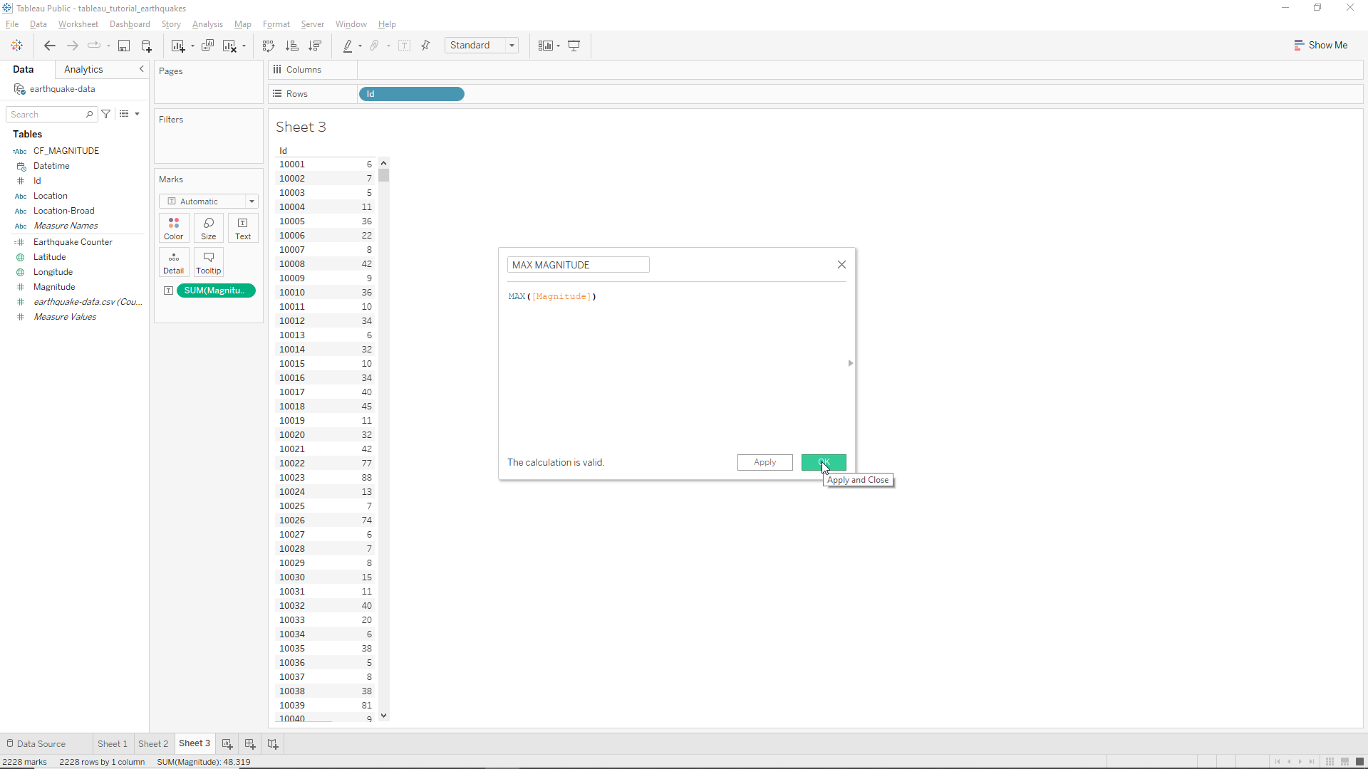
Let’s now get rid of the calculated field in the Rows field and do something different. We want to calculate the magnitude ratios relative to the maximum magnitude of all Earthquakes or a selection of them. We start by creating a new calculated field to calculate the maximum magnitudes called Max Magnitude, write
MAX([Magnitude])
and hit OK as shown below.
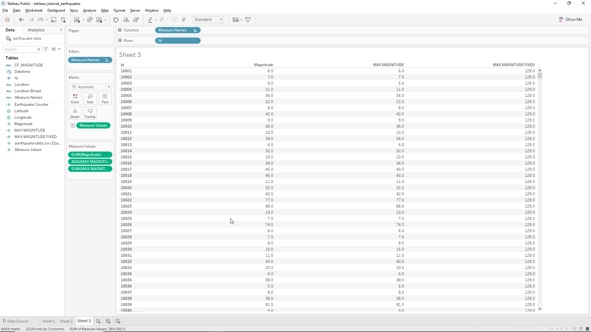
From here we drag the new variable to the Sheet. However we immediately observe that Tableau is aggregating the maximum values by Id meaning that the Magnitude and Max Magnitude values are the same!. To fix this let’s create another calculated field called Max Magnitude Fixed. We now need to introduce the concept of level of detail. Basically this allows us to address which level of detail we want to include in our new variable. The syntax is the following:
{TYPE [DIMENSION LIST]: AGGREGATION},
where TYPE is the function we want to use, DIMENSION LIST will be the level of detail and AGGREGATION the type of aggregation function to use. In our case we will use the following calculated field
{FIXED : MAX([Magnitude])},
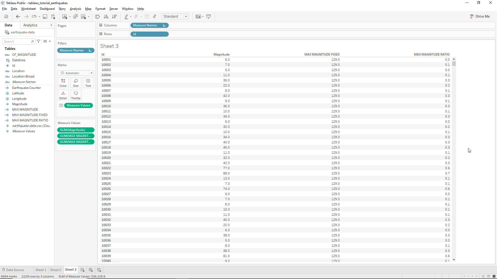
where the DIMENSION LIST is left blank because as default it will use all values. Now if we drag the new variable to the Sheet 3 field we obtain the following table, where the Max Magnitude Fixed is now 129, which corresponds to the maximum magnitude of ALL Earthquakes.
Now we get rid of the original Max magnitude field by dragging it off from the Measure Values field. We’ll now create a new calculated field to calculate the maximum magnitude ratio at the Id level with the following code
[Magnitude] / [MAX MAGNITUDE FIXED]
We drag the calculated field to the Sheet and obtain the following result as shown in the Figure below.
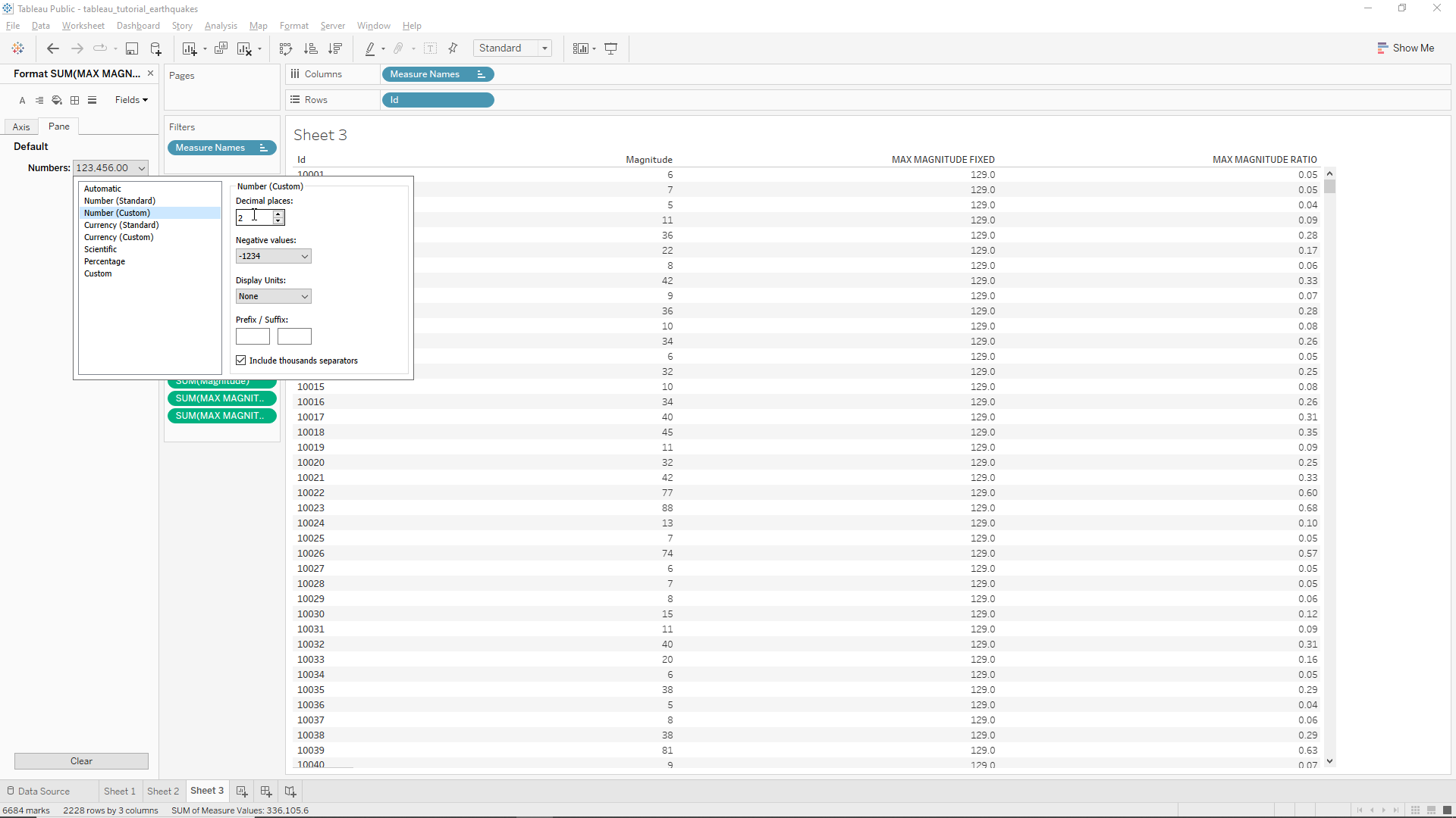
We want two decimal places in the ratio so we head to the Measured Values field, click on the drop-down menu, then click on Format.... Then, on the Pane section, click on Numbers, and then on Numbers (custom). It will automatically display two decimal places as shown in the Figure below.
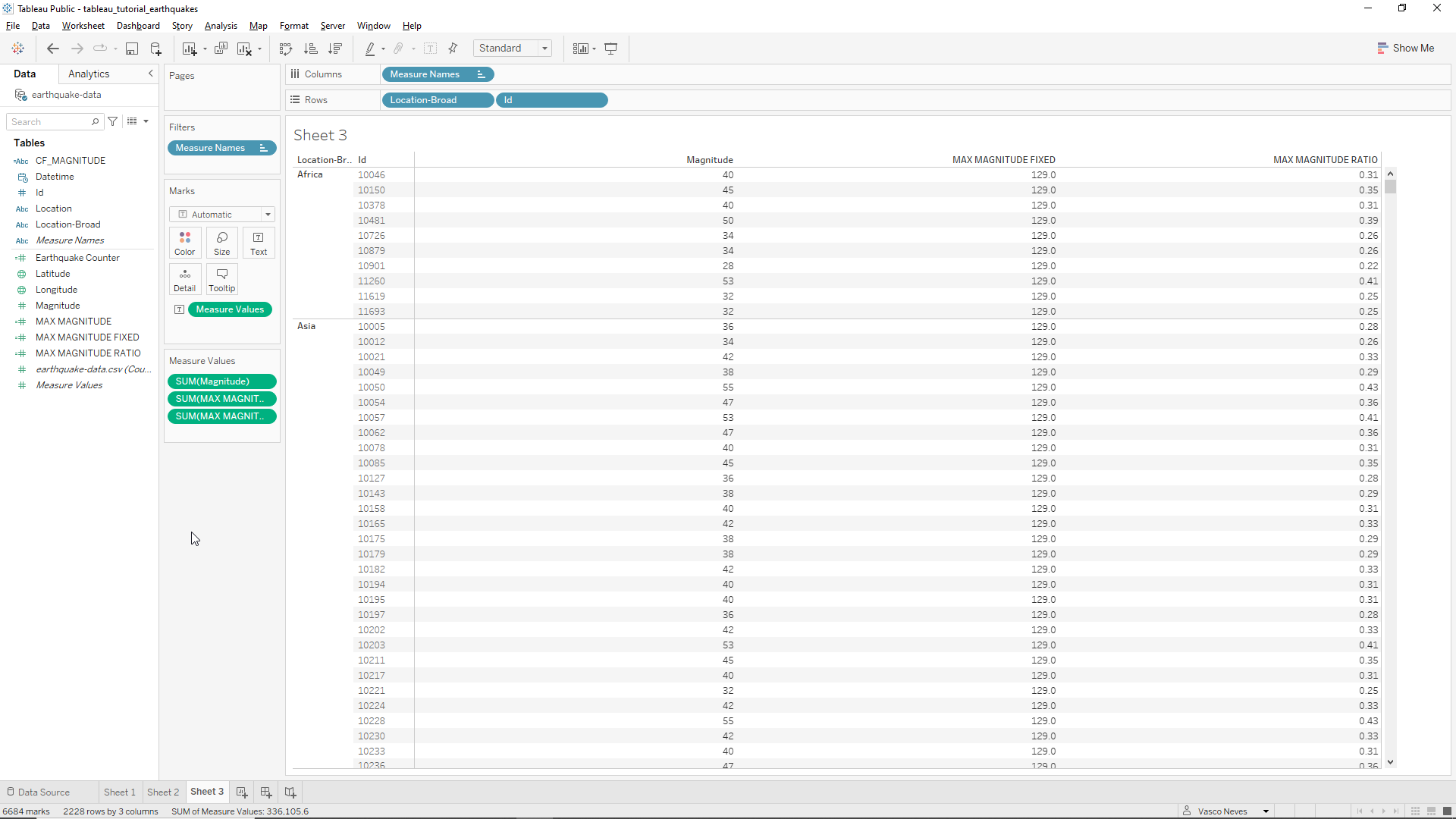
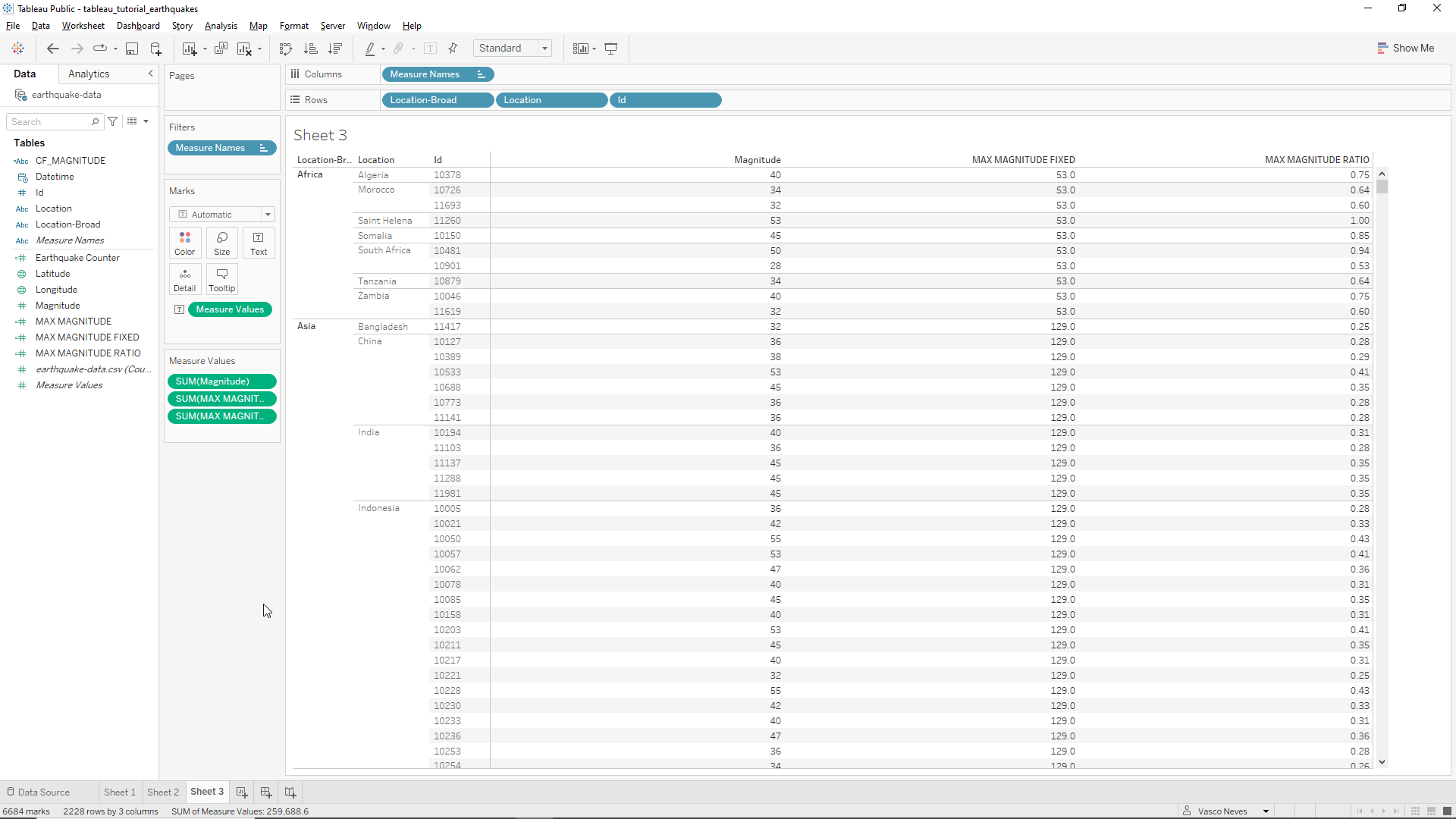
Now suppose we want the level of detail at the Continental level. The first thing we need to add is the Location-Broad variable into the mix. We’ll just drag it to the Rows field. We now have a regional level of detail as shown in the Figure below. However we can observe that the MAX MAGNITUDE FIXED and the MAX MAGNITUDE RATIO variables continue to be calculated at the global level.
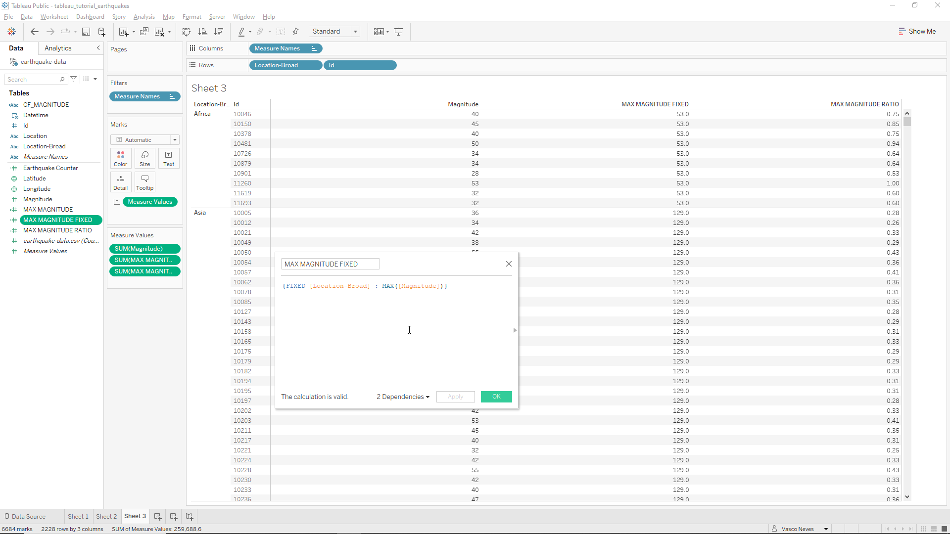
To fix this we can add in our MAX MAGNITUDE FIXED formula the variable Location-Broad as a [DIMENSION LIST] variable. We just need to edit the formula and write
{FIXED [Location-Broad] : MAX([Magnitude])}.
The result is shown in the Figure below. We now hav both the maximum magnitude and the max ratio calculated at the continental level of detail!
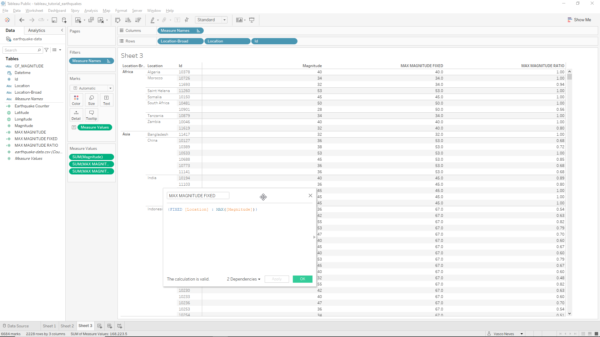
If we want to increase the level of detail to a country level for instance we can first add the location variable in the Rows field, between Location-Broad and Id, as shown below. **We can observe that, despite now having country level information, the MAX fields continue to calculate their values at the continental level. In other words, nothing has changed.
To modify this we simply have to change the level of detail variable in the MAX MAGNITUDE FIXED field from Location-Broad to Location
{FIXED [Location] : MAX([Magnitude])}.
The result is shown below. The two MAX fields are now calculated at the country level of detail.
It is worth noting that filters do not change any of the calculated values.
Applied example - A client’s request
Now that we’ve seen the basics let’s apply what we’ve learned to a practical example.
Our client needs to understand and visualize global earthquake patterns, and is requesting that we create a dashboard to show in a simple and clear way to different stakeholders what we can find from the provided 30-day Earthquake data. In this fictional hypothetical scenario our client will be the EarthScope Consortium. The requirements for the dashboard are the following:
- In needs a Map showing the location of the Earthquakes, clearly showing their intensity in terms of magnitude.
- It needs a list of the top 10 biggest Earthquakes.
- It needs a breakdown of the percentage of Earthquakes that ocurred in each broad location.
- At a more granular level (more detailed) it needs to show how many Earthquakes took place, their average magnitude, and the maximum magnitude.
- A single data filter is also requested so that it is possible to move the Earthquake data back and forth day by day, manually as well as sequentially.
Let’s start!
Best practices
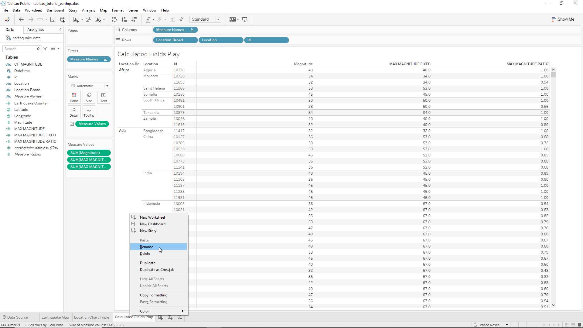
Before moving on to the dashboard we should organize our data. Let’s start by naming our worksheets. Let’s call Sheet 1 as Earthquake Map, Sheet 2 as Location Chart Triple, and Sheet 3 as Calculated Fields Play.
To to this we just need to right-click on each of the Sheets and click on rename, as shown below.
Top 10 Largest Earthquakes Worksheet
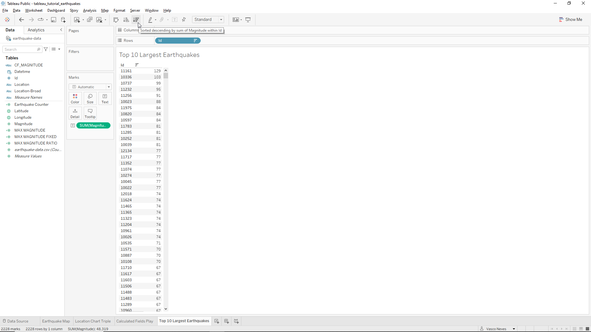
We also need a fourth Sheet which we will rename Top 10 Largest Earthquakes. First we will drag the Id variable into the Sheet and then the Magnitude variable. We also sort the magnitude values in descending order by clicking the sort button as shown in the Figure below.
To only show the top 10 Earthquakes, we need to create a calculated field variable named Top 10 filter. We use the INDEX command that returns the row number with the following logic
INDEX() <= 10
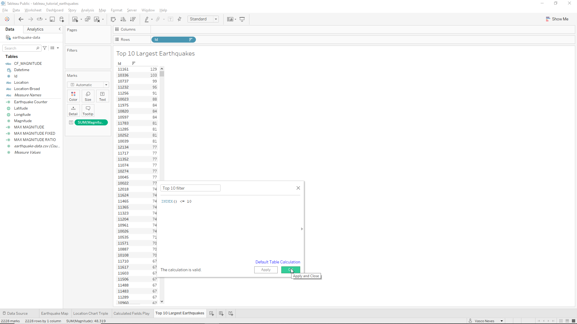
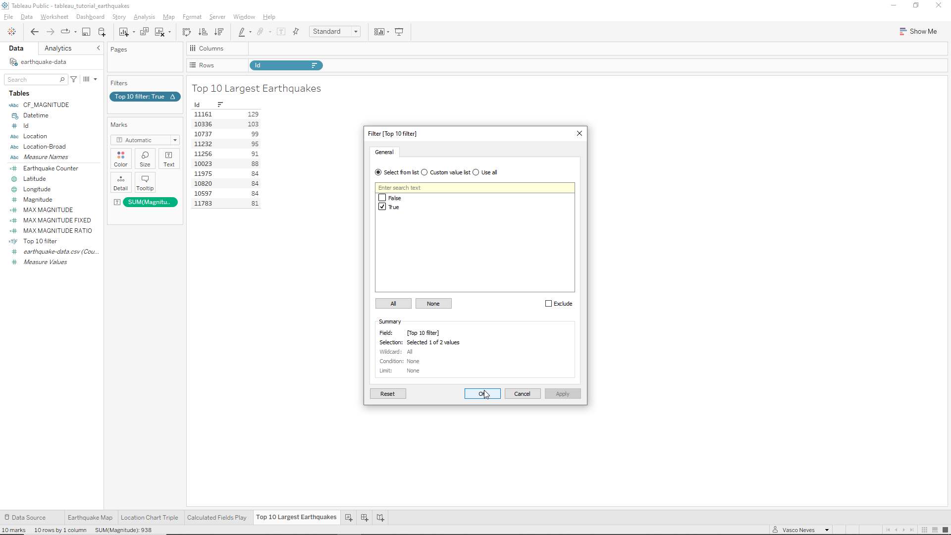
We then drag this variable into the Filter field, and when the pop-up box appears click on the True box and then OK, as shown below.
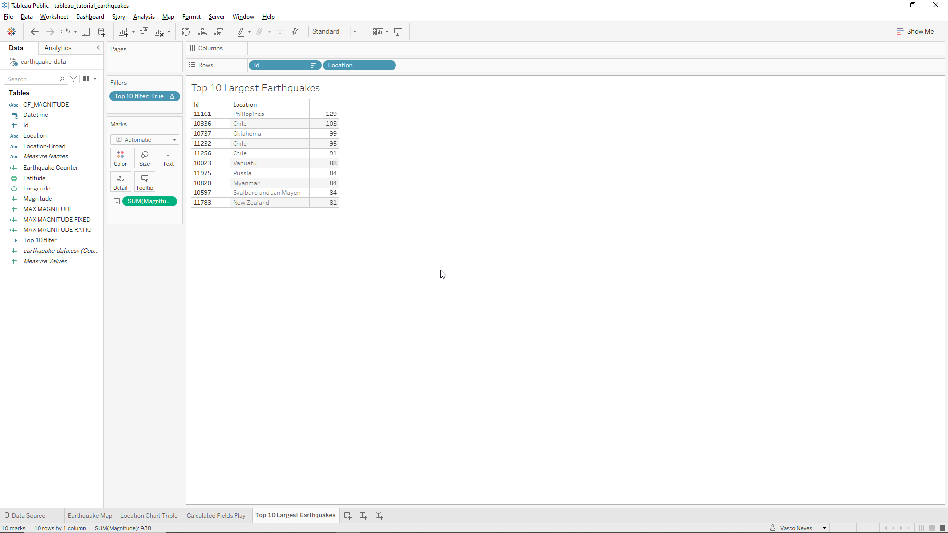
Now that we have our Top 10 Earthquakes we can also add the Location variable to the Rows field to make the table more informative as shown below.
We note however that the magnitude variable in our table does not have a label! To fix this, let’s drag the Measure Names variable onto our table, in the Magnitude values. We obtain, however, two repeated Magnitude labels as shown below. To fix this we simply remove one of the Measure Names variable from the Columns field.
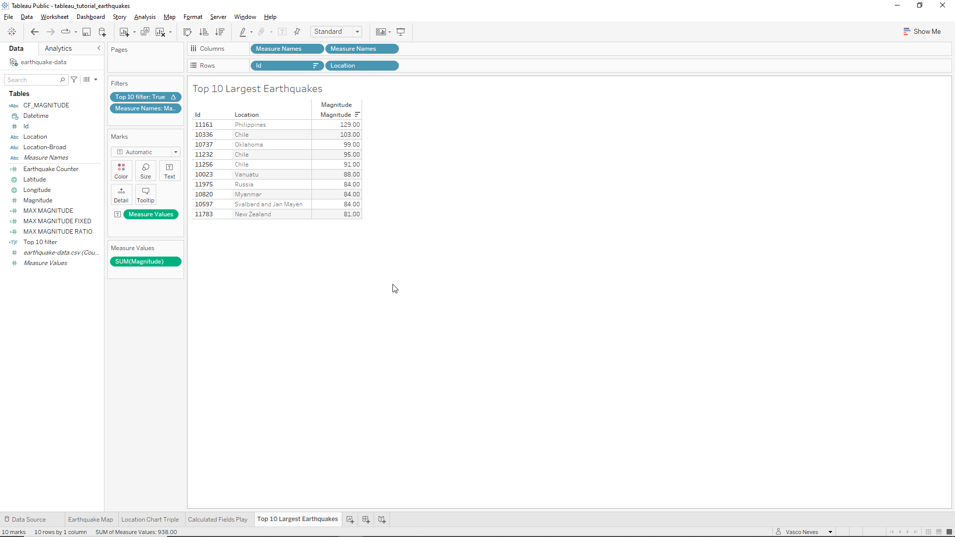
As before let’s just remove the decimal places of the magnitude values. The end result is shown below.
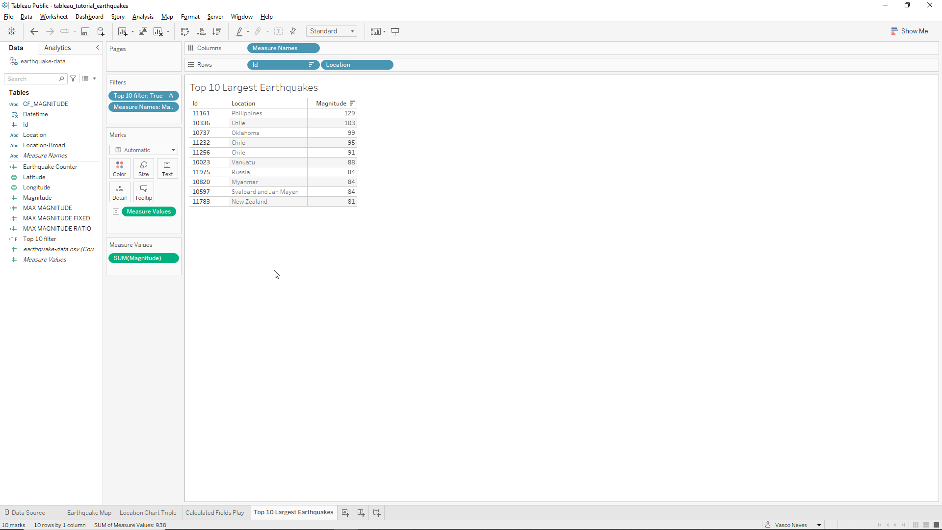
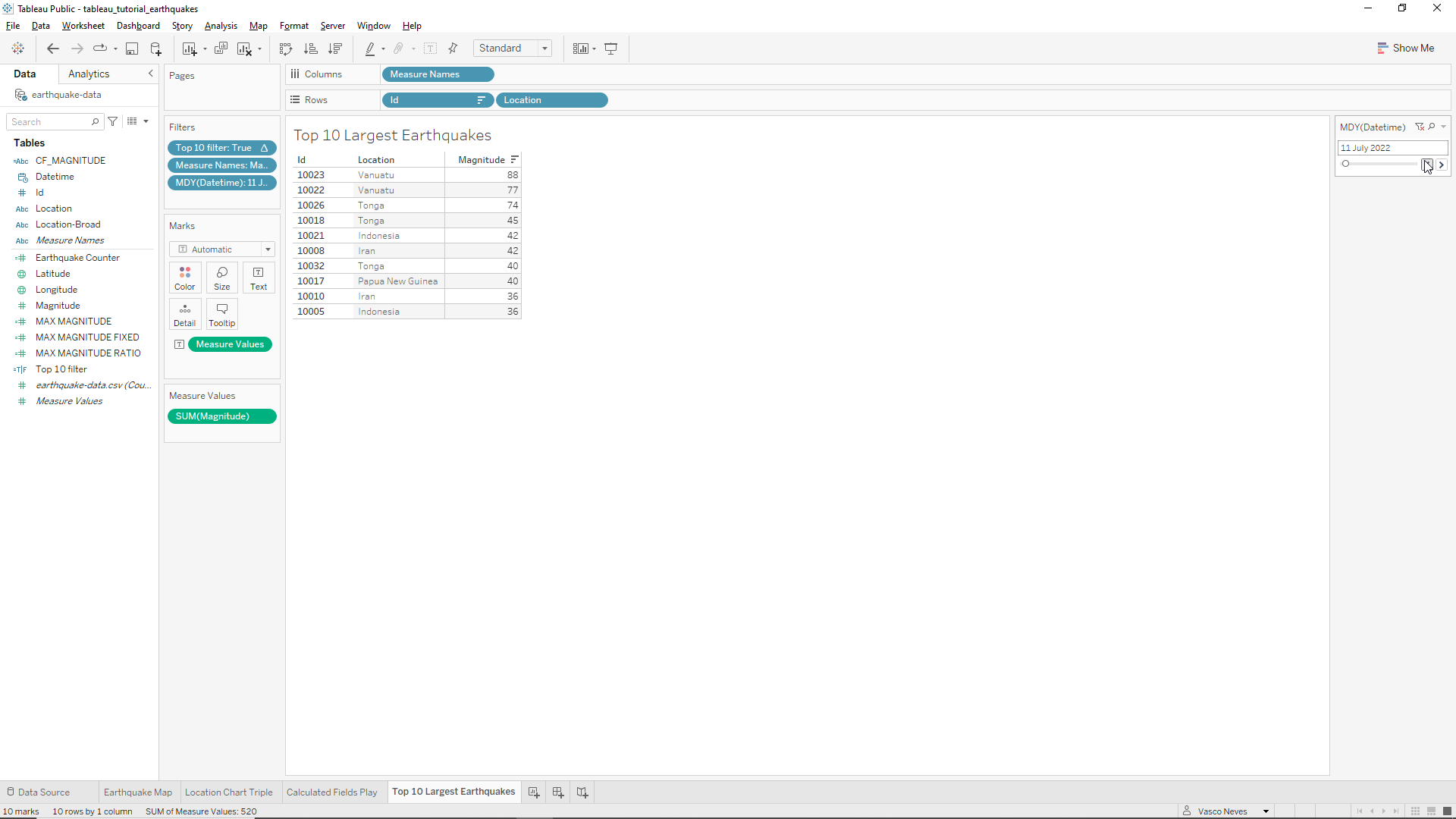
We still need to filter by date. To do this, we just need to drag the Datetime variable onto our Filter field. As usual we choose the option Month/Day/Year and then click on Next and the click on All and OK. Then we click on the drop-down menu of the Datetime variable in the Filter field and select Show filter. Finally, on the right, we click on the drop-down menu of the filter and select Single Value (slider). The end result is shown below. We can now browse the top 10 Earthquakes by date.
Percentage of Earthquakes by Broad Location
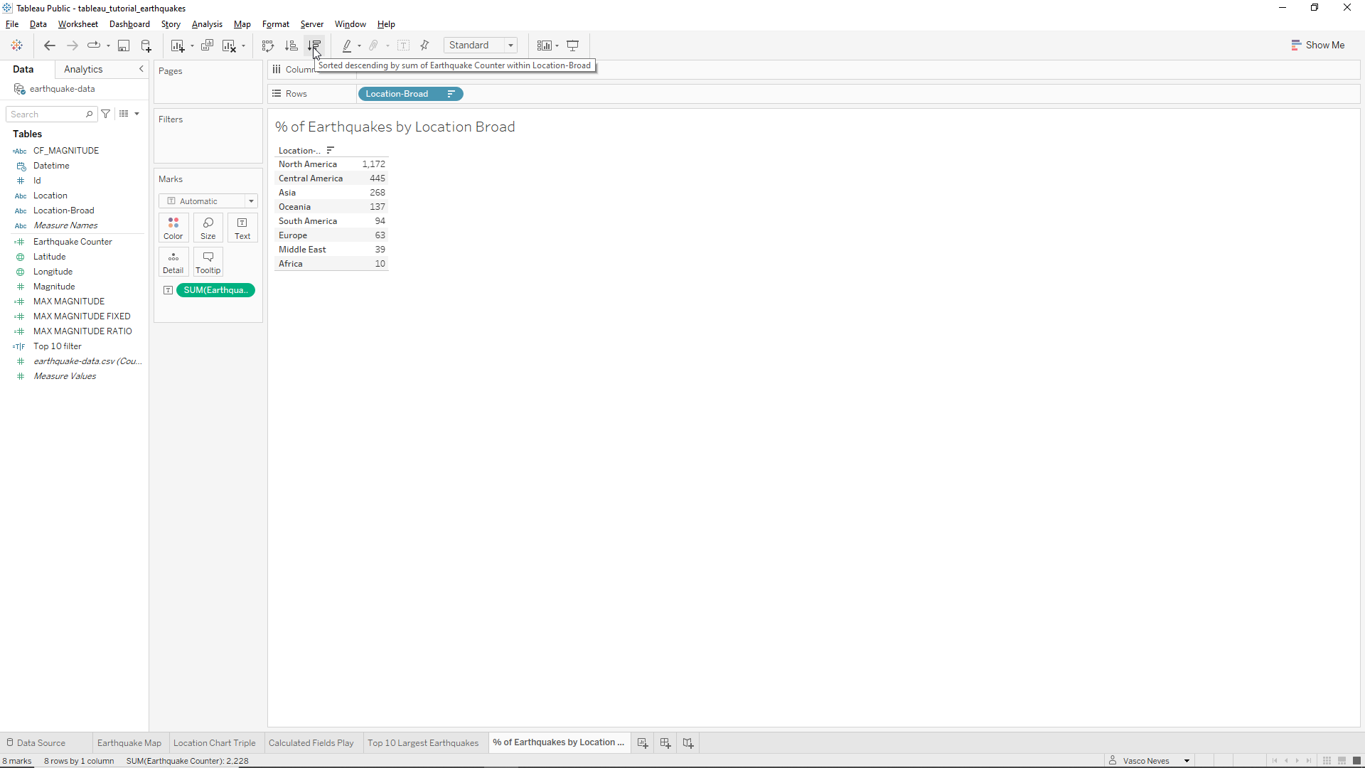
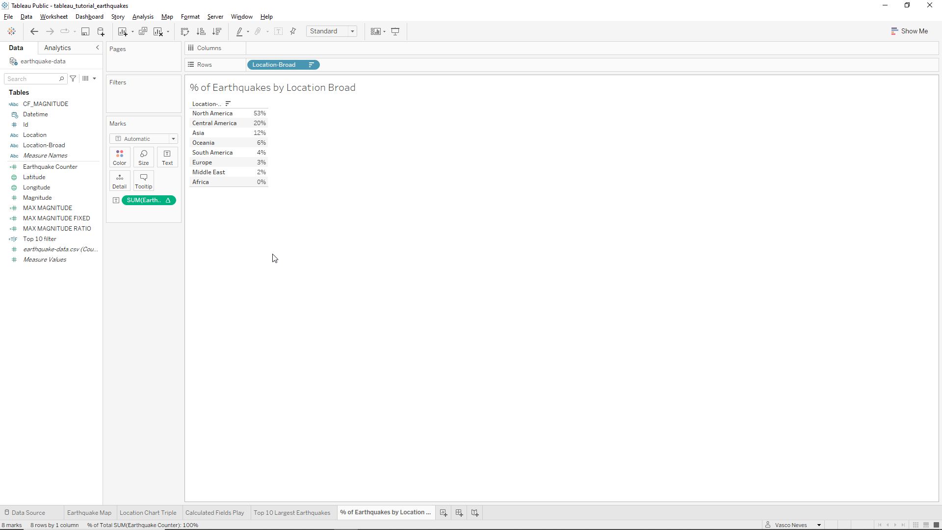
One of the requirements of our client was to display the percentage of Earthquakes by broad location. To do this we will create a fifth worksheet named % of Earthquakes by Location Broad. After creating the sheet we drag the Location-Broad variable onto the row sheet section. As we’re interested in Earthquake frequencies we will need a counter. We already have a counter field created, therefore we just need to drag the Earthquake Counter field into the worksheet at the right of the Location-Broad variable. We should also sort the column by descending order as shown in the Picture below.
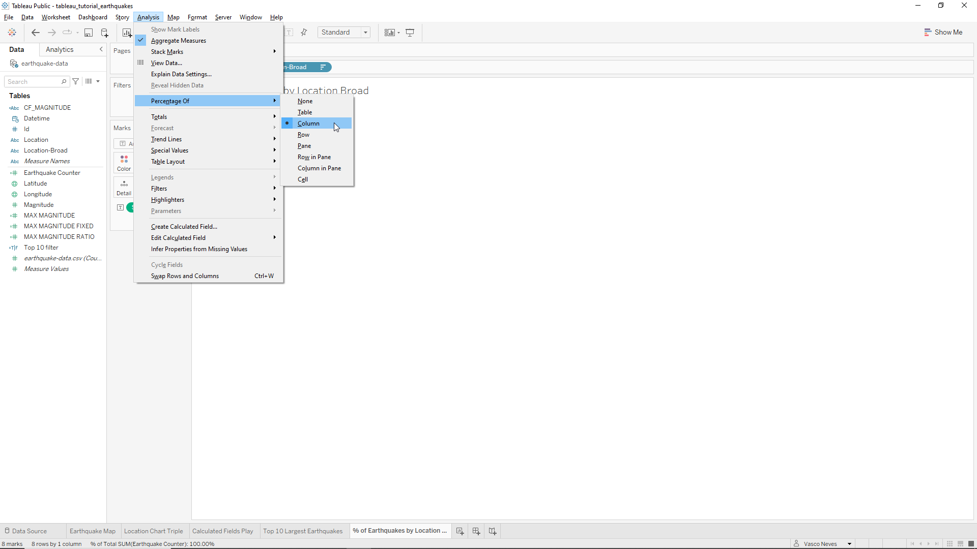
Finally, to calculate the percentages of the total Earthquakes, we just need to click on the Analysis menu on the top, and then Percentages and Column as shown below.
We will now just remove the two default decimal places from the percentage. The end result is shown below.
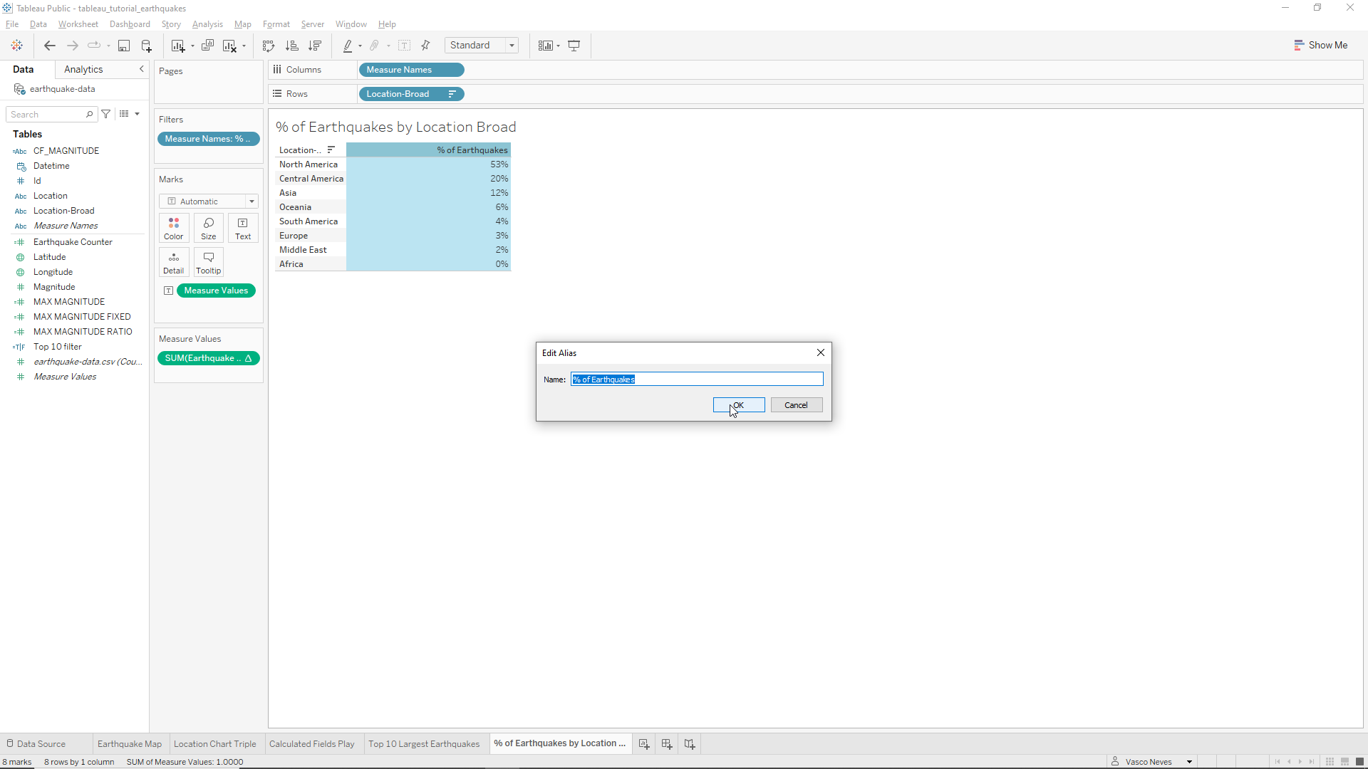
To get a label for the percentage column we just need to drag Measure names onto the sheet column and then remove one of the Measure Names in the Columns field as before. The name provided by Tableau is huge. To change it, we right-click on the sheet column, click on Edit Alias, and then write ‘% of Earthquakes’ as shown below.
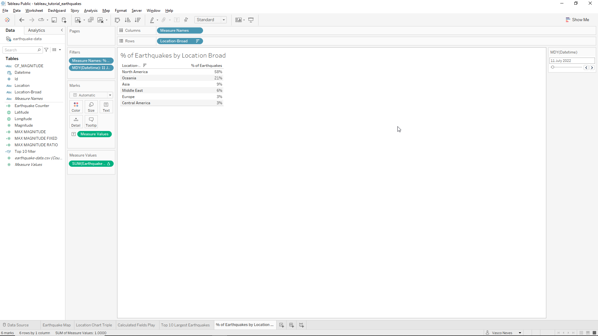
To finish we just need to add the Datetime variable as before as a slider.
The dashboard - first steps
To create our dashboard we first need to create a blank one. To do this we click on + sign with a grid located at the bottom center of the window as shown below.
First we change the Size field on the left hand side of the Window to automatic. To do this we first click on the values there and then click on Range and change to Automatic. This will make the dashboard to adapt to the windows size which is quite convenient.
At the Sheets field, also on the left, we see the worksheets we created. Is is worth noting the importance of creating a clear labelling here. At the bottom left of the screen we have a field called Objects which are elements we can use to create our dashboard. At the bottom of the Objects field we have the buttons Tiled and Floating. When Tiled is on it means that the elements snap into place, more or less where we dropped them. Floating, on the other hand, means that we have full control of the position of the elements, which will hover above the window.
Let’s first name our Dashboard. To do this we just need to right-click on Dashboard 1 button at the bottom of the Window and then click on Rename. Let’s call it Earthquake Analyzer.
Let’s first summarize what we need and make a draft of the Dashboard by hand as shown below.
We need:
- A title
- Earthquake map with magnitudes
- Top 10 biggest Earthquakes list
- Percentage of Earthquakes in each broad location
- Frequency, average and maximum magnitudes by location
- All data should be attached to a general date filter
Building the dashboard
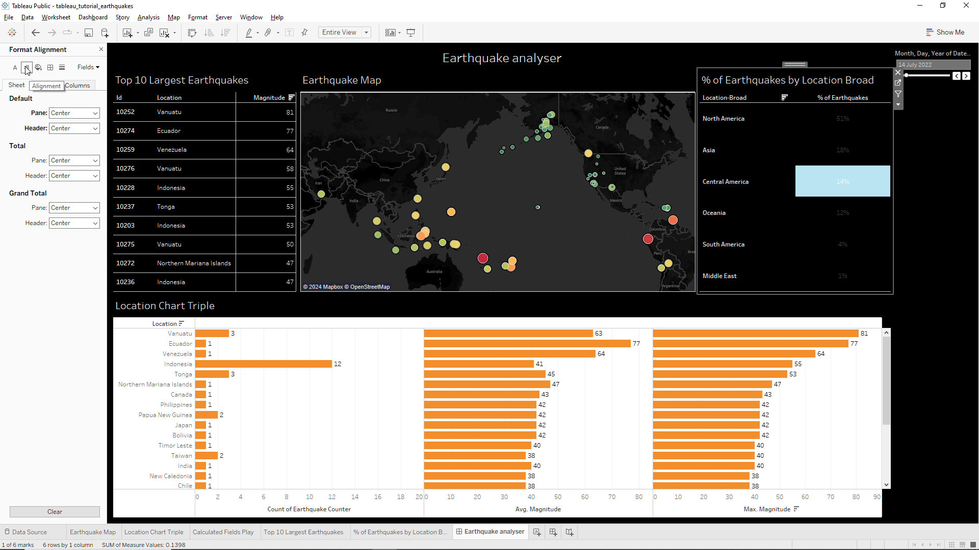
Let’s start with the title. To insert the dashboard title we click on Show dashboard title button located at the bottom left corner of the screen. We want the title centered so we right click on the title field and click on Format title and then click on Alignment/Center.
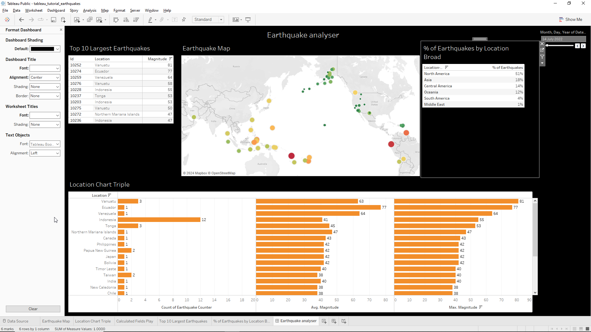
Let’s now add the map. It makes sense that the make takes center stage so we place it in the middle. To do this we just need to drag Earthquake Map from the Sheets field into the dashboard. The map uses all space available. Along with the map the legend is also imported to the dashboard, which are located on the right hand side of the screen as shown below.
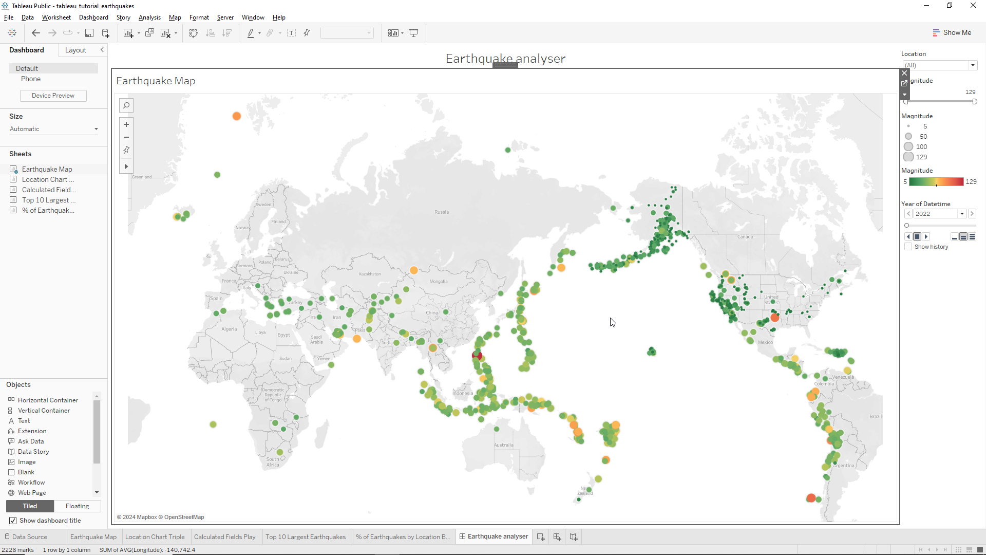
The next component we’re adding is the Location chart with the three graphs containing the frequency, average, and maximum magnitude of the Earthquakes. Let’s drag it to the bottom part of the dashboard, in a way that it will fit below the map. The end result is shown below.
We don’t need all those legends on the right. We will remove all except the time slider at the bottom of the legend boxes. To to this we click on each of these boxes and then click on the X to remove them as shown below.
The end result is shown in the following Figure.
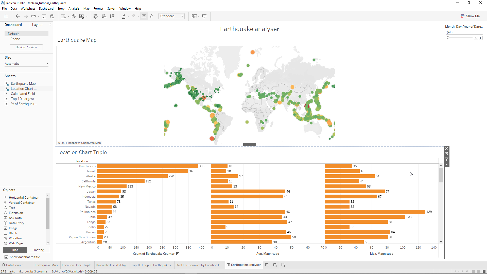
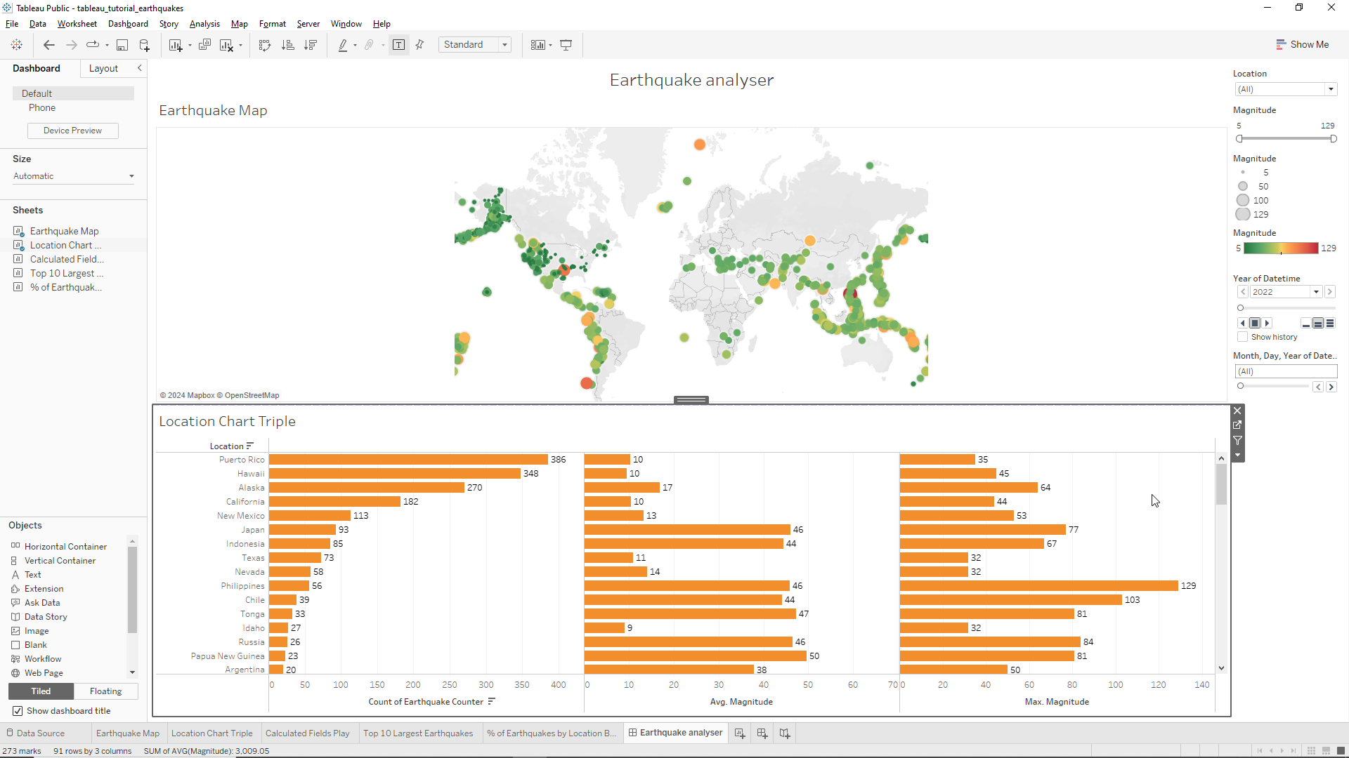
If we experiment changing the data we notice that the bar plots change with the data but the map does not. This is because the legend is tied to the Location Chart Triple. We will take care of this at the end.
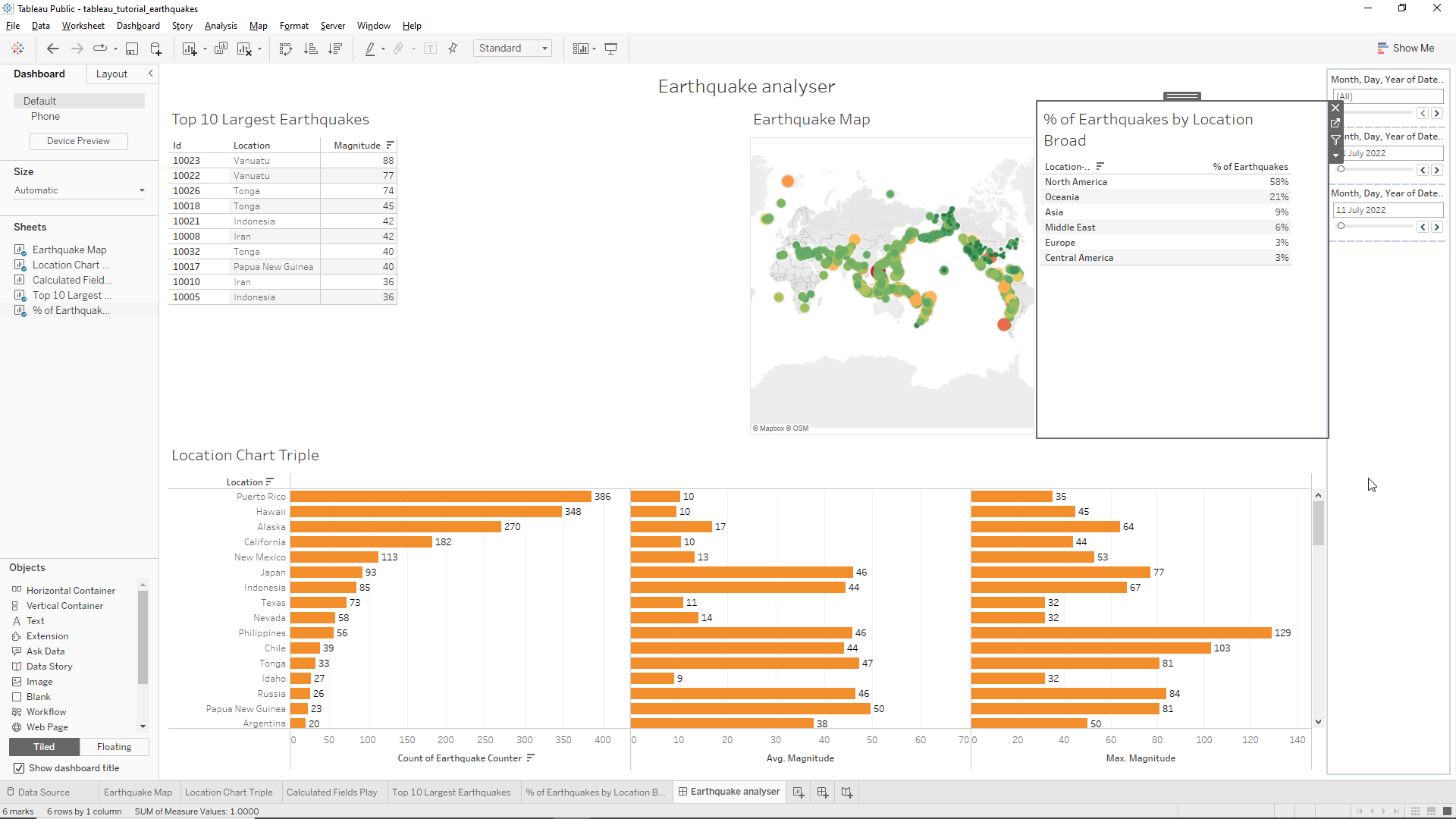
We will now drag the Top 10 Largest Earthquakes sheet to the left of the map and to the top of the triple charts. Then, we will also drag the `% of Earthquakes by Location Broad to the right of the map and to the top of the triple chart. The end result is shown below. We should also remove the two new legend that appeared on the right hand side of the screen.
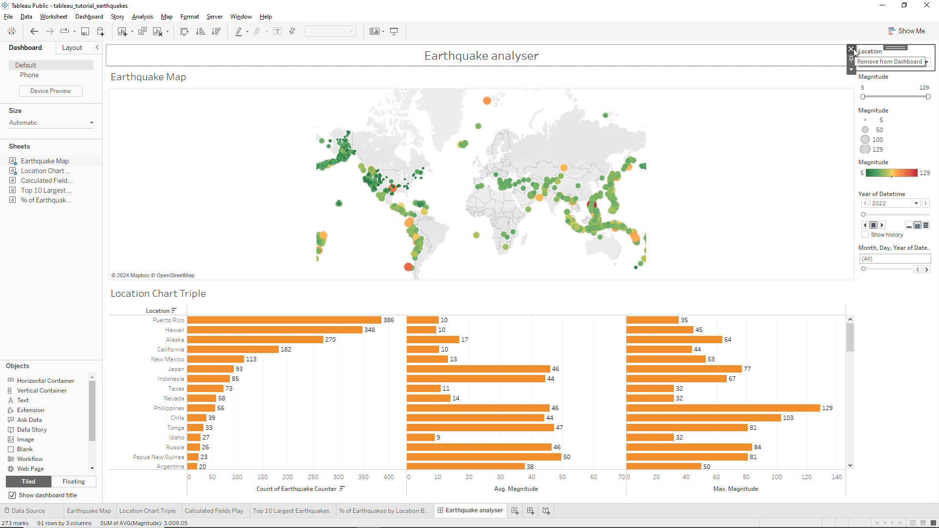
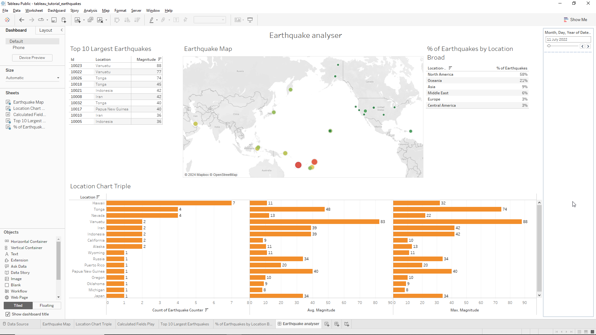
We should now tie the time legend to all the dashboard worksheets. To do this we need to click on the down button of the datetime legend on the right and then click Apply to Worksheets/Select Worksheets as shown in the following Figure.
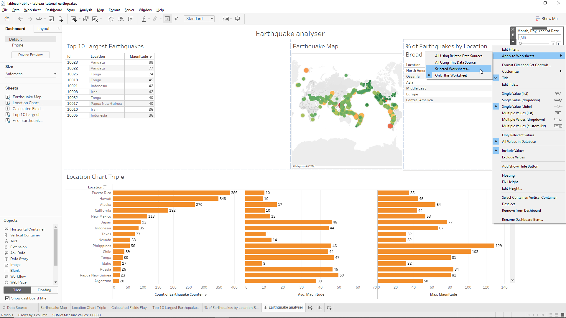
In the new windows, just click on Select all on dashboard and then OK. Finally we just need to expand the map window to the left as shown in the Figure below.
We will now format the dashboard a little to make it more attractive to the end user. To do this we first head to the menu and click on Format/Dashboard. The format dashboard box appears on the left of the screen. In this section we change the Dashboard shading to black and the Dashboard title font and the Worksheet titles to white. The end result is shown below.
Now let’s move to the worksheets. We start by right clicking on the map and selecting Background layers. This will open a new section on the left. We go to Style and change to dark. The changes are shown below.
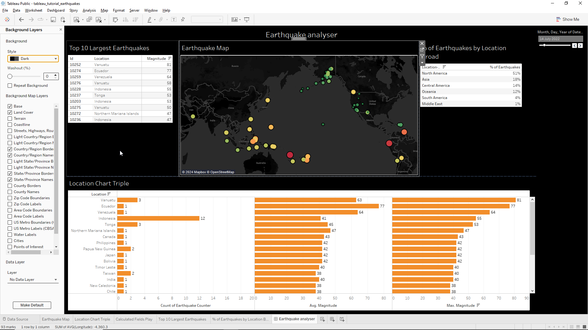
We notice that the borders of the points are too thick for a smaller sized map. To change this we need to go to the Earthquake Map sheet (click on the bottom) and select Color in the Marks field. Here, we go to Border and select the gray color below the mouse pointer as shown below. The colors are now less heavy but this is, of course, rather subjective!
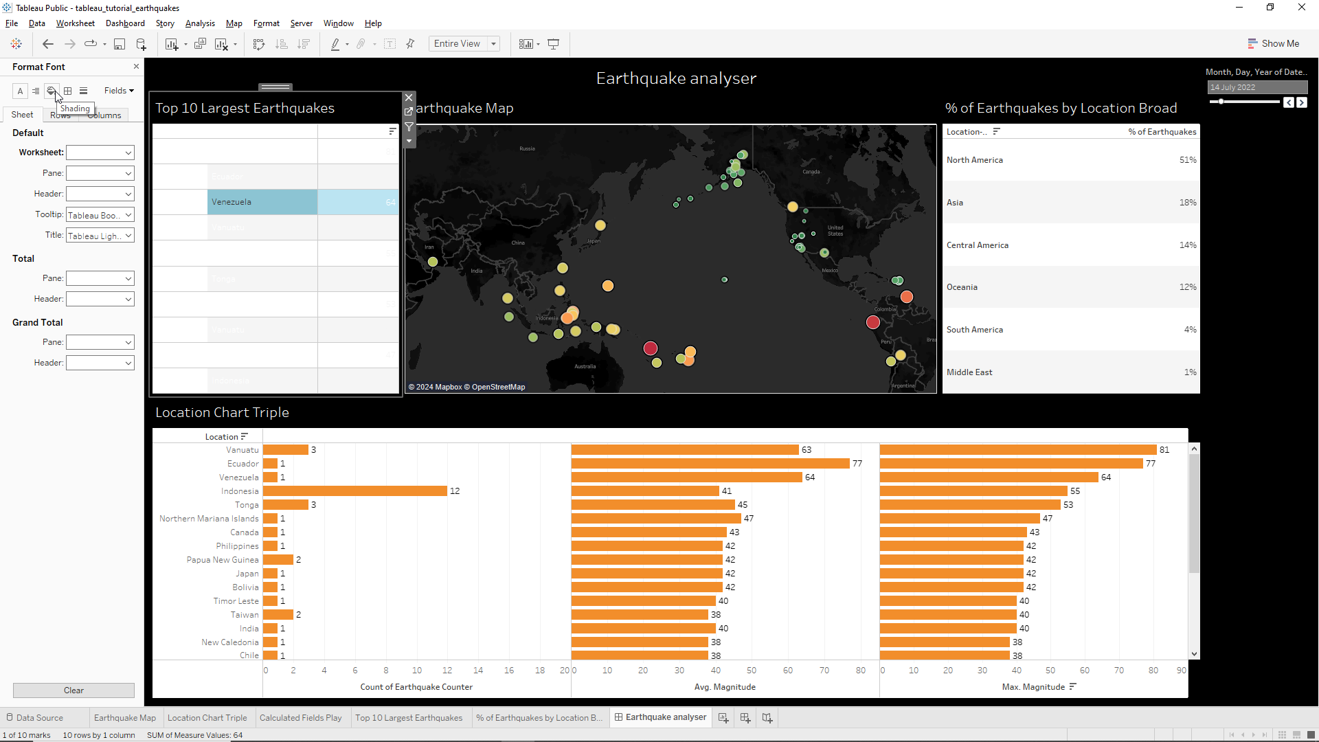
Let’s now move to the Top 10 Largest Earthquakes table. We observe there is a lot of empty space below the table. To fix this, we right-click on the box outside the table and select Fit/Entire view. The table will now fill the whole space! The next step is to change the table colors itself. We start by right-clicking on any cell from the Location column and select Format. The format menu appears on the right, with the font section pre-selected. Here, we need to click on the font icon (the A shown by the mouse pointer below).

We change the color of Worksheet to white.
We then click on the Shader icon which is located where the mouse pointer is in the /img/earthquake_tracker/image below.
Here we change the color of the Worksheet to black as well as the Row Banding Pane and Header. We do the same procedure for the % Earthquakes by Location Broad table. We also increase the width of the Location-Broad column and center the % of Earthquakes column by right clicking into a cell in the % of Earthquakes column, selecting Format and then click on the alignment icon as shown below. Then click on Sheet/Default/Pane and select center and the same on Header.
Now we observe that the grid lines are different between the two tables. To rectify this we right click on the % Earthquakes by Location Broad table and select Format. Then, we select the Borders icon as shown in the figure.
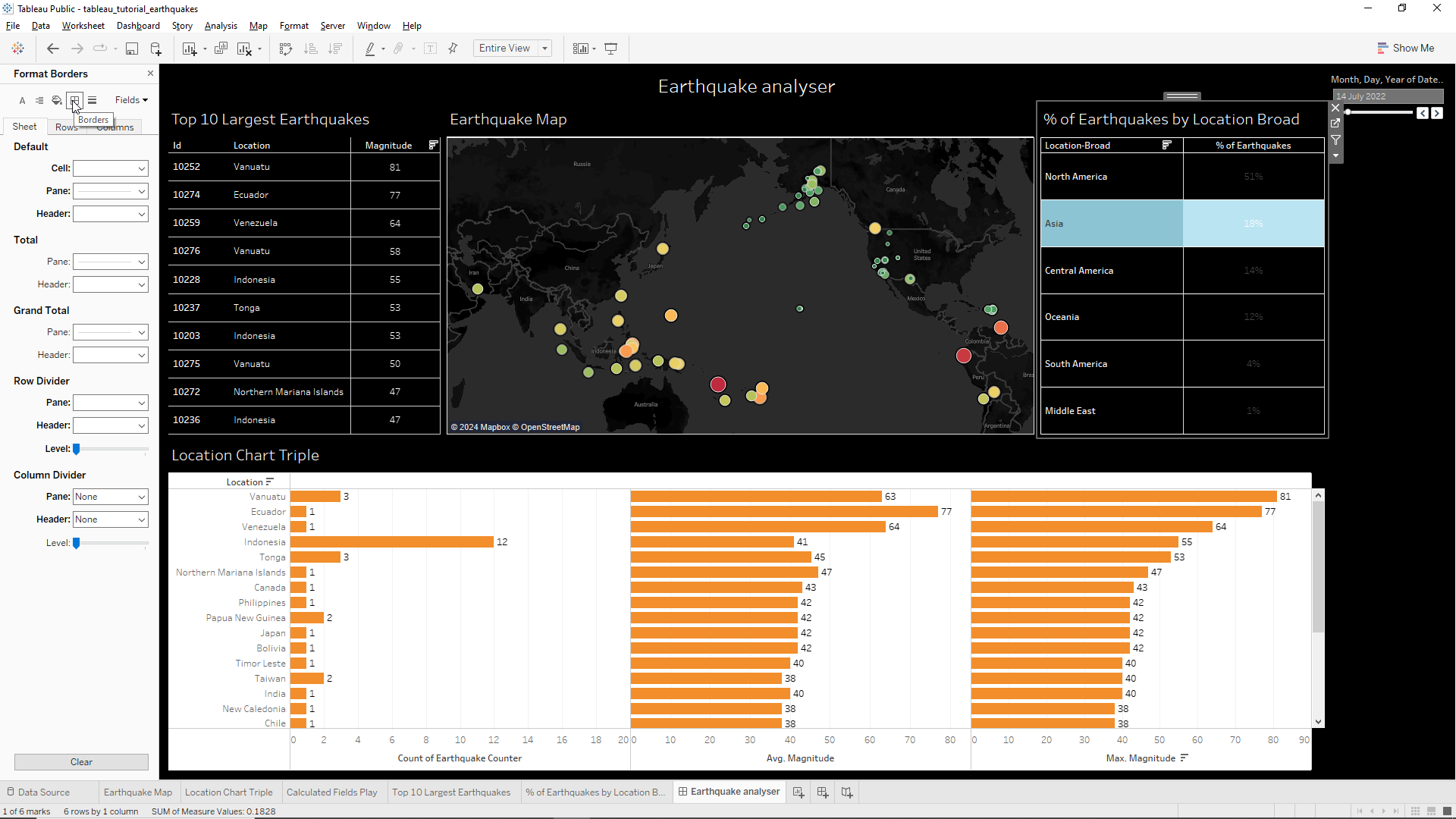
From here we change the Sheet/Default cell and Header to white. We go back to the Top 10 Largest Earthquakes table and do the same treatment. The Picture below shows the final result.
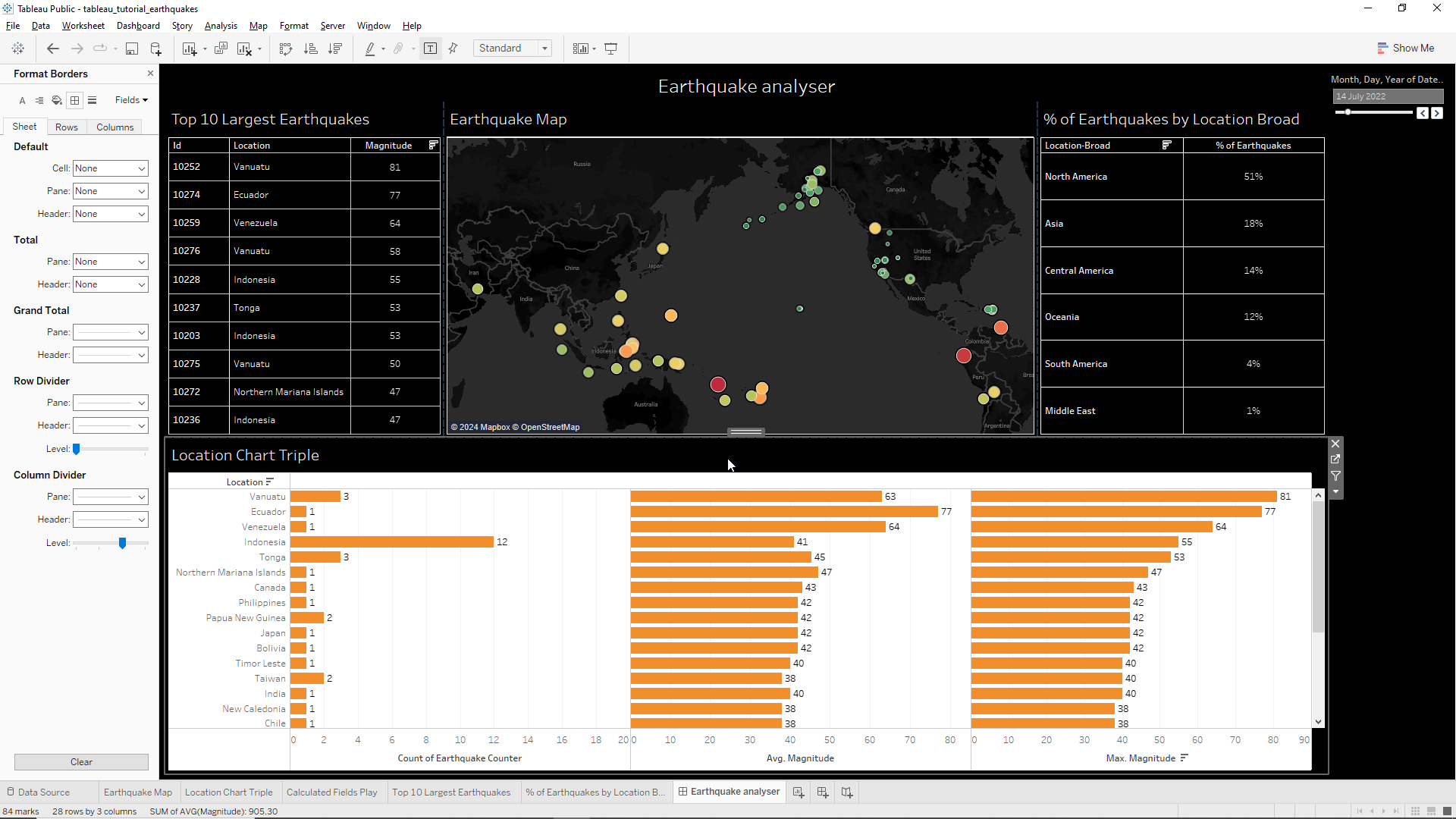
Let’s now move to the bottom triple chart. First, we right-lick onto the table and select Format. The, we select the Font icon and under Default/Worksheet we select white. We click on the Shading icon, select Default/Worksheet and click on the black color. The graphs looks nicer but seem a bit heavy to the look. Let’s try to soften things a bit by clicking in the Borders icon. Then we click on the Row Divider/Pane and select None and do the same on the Column Divider/Pane.
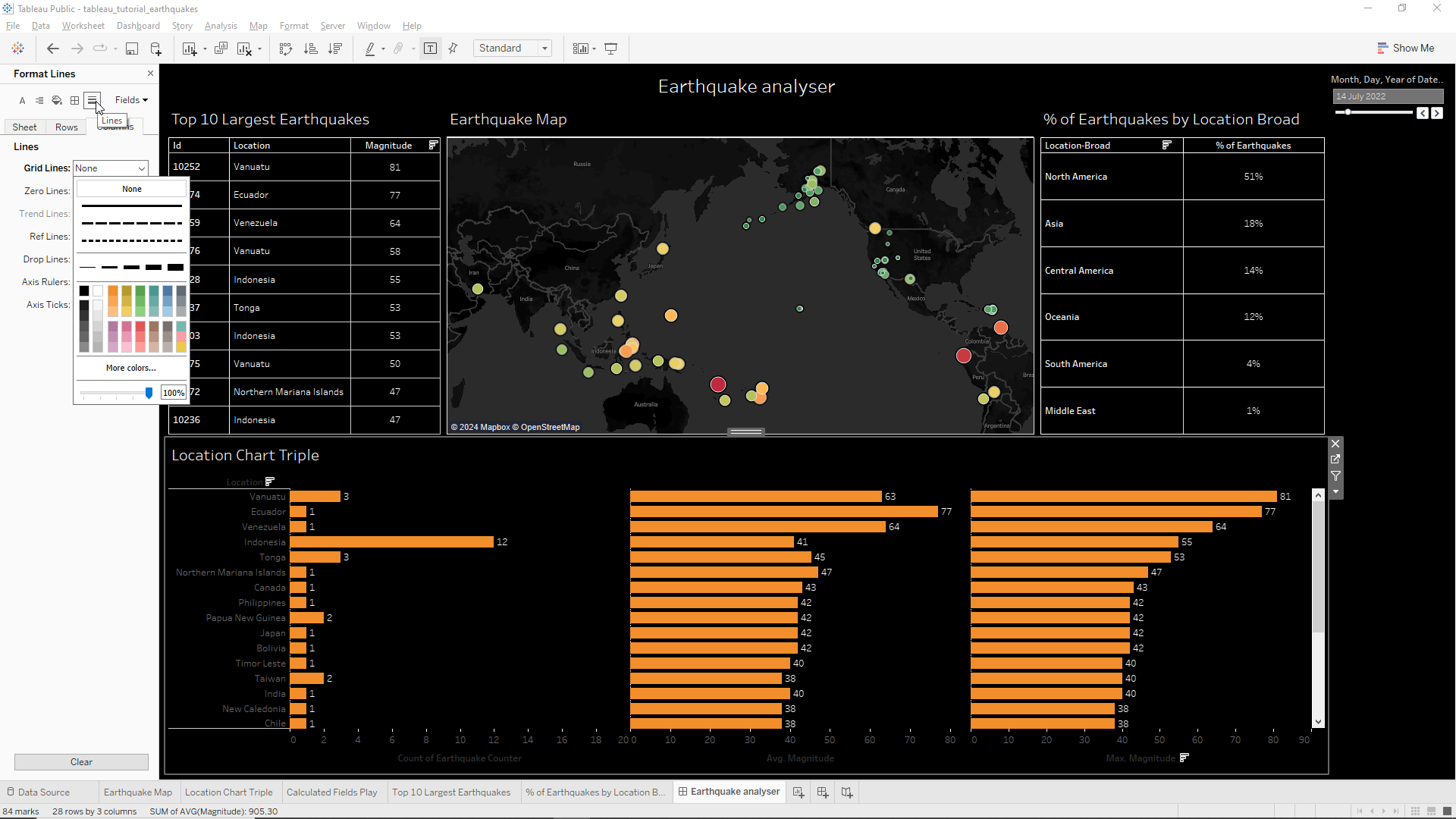
We can also optionally remove the vertical grid bars by clicking in the Lines icon as shown below and select None in Lines/Grid Lines.
Finishing touches
We will now apply some finishing touches to our dashboard to make it more appealing to the stakeholders. We start by right-clicking on the title and selecting Edit Title. Then, we first select all the text in the box and then choose a font with size 24 and boldface. To finish we click OK.
We notice that the filter field on the right has a lot of empty space. We’d like to remove that and use the empty space on the right of the title to place our datetime filter. However, as this is a tiled object it will not fit within the space of the title file. To do this we need to change the filter field from being a tile to a floating object. To do this we just need to click on the drop down menu of the filter box and click on Floating as shown below.
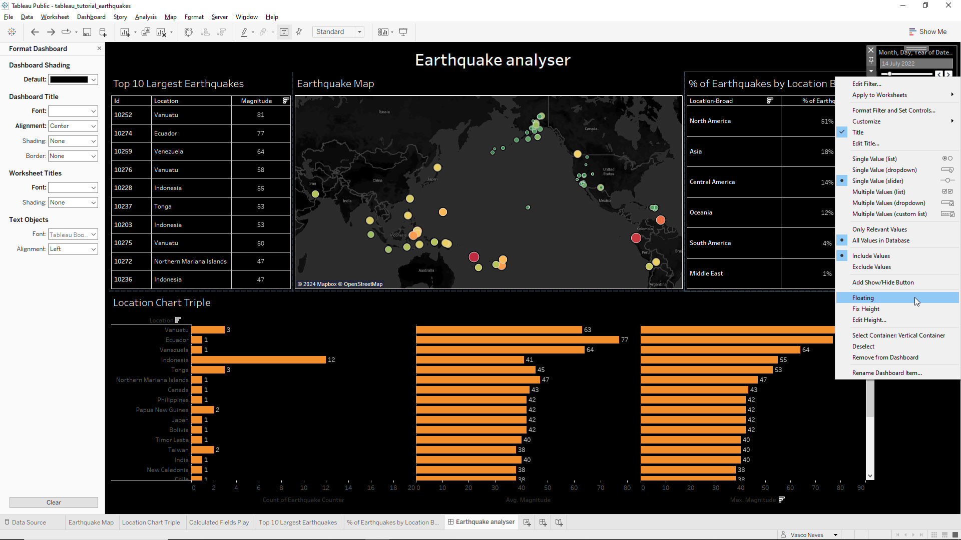
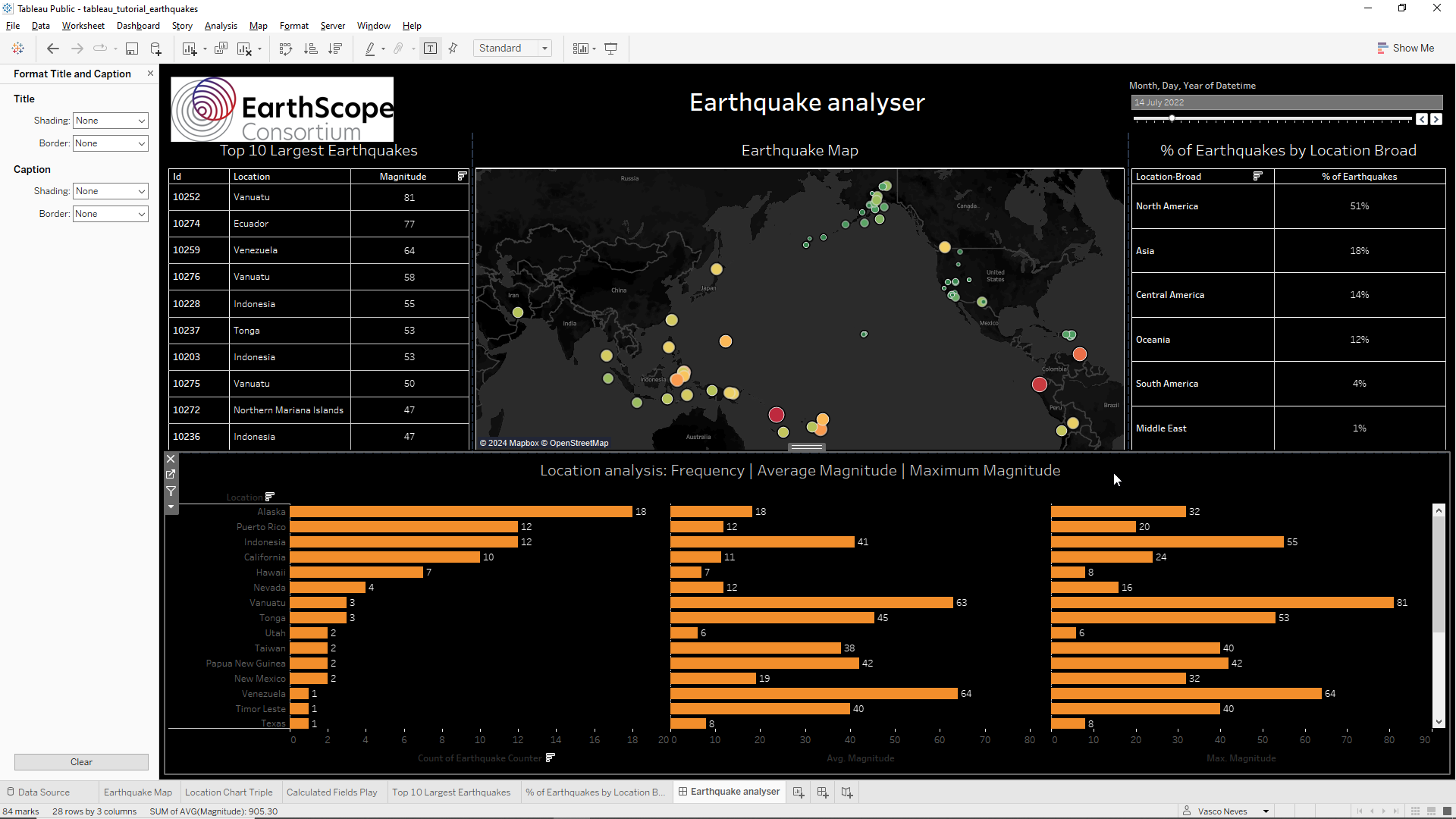
From here we just drag the floating object to fit on the top right corner of the dashboard after removing the legend section where the filter was previously located. The dashboard adapts dynamically and expands to the new space. We notice that our floating object does not have enough space to fit up there in the corner so we need to expand the title window a little bit further down. Once that is done, we can also expand the date filter to cover the width of the table just below for aesthetic reasons.
We will now finish the dashboard off by adding the logo of our fictional client, Earthscope Consortium. To do this we download the logo at https://ds.iris.edu/seismon/imgs/esc_logo2_rgb.svg and place it on the top left corner of the dashboard as a floating object. To do this, we go to the Objects field on the bottom left corner of the Screen and click on the Floating box. Then, we drag /img/earthquake_tracker/image to somewhere near the top left corner of the screen and then select Choose when the pop-up window appears. We select the downloaded /img/earthquake_tracker/image and hit OK. Then we move the picture to its final location.
We will now just center the titles of all worksheets except the bottom one. For instance, to center the Top 10 Largest Earthquakes table we just right-click on the title and select Edit title. We then click on the center text icon and click OK. We do the same for the Earthquake Map and for the % of Earthquakes by Broad location.
We also center the Location Chart triple title but this time we will change the title label to Location analysis: Frequency | Average Magnitude | Maximum Magnitude and click OK. The following picture shows all the work done so far.
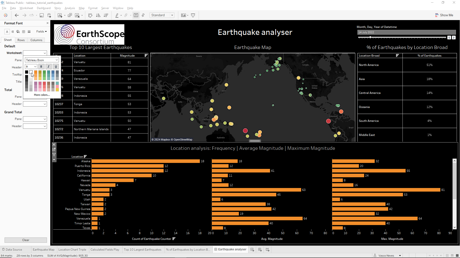
We notice that the triple chart labels and locations are not very visible. To change this we first right-click on the triple chart and select Format. Then, we click on the Font icon and on Sheet/Worksheet we select white as shown below.
We also notice that the chart descriptions at the bottom axis are not clear. To change this we right-click on the axis and select Edit Axis. On Axis titles we change the name to Earthquake frequency. We do the same on the middle and on the right hand chart, changing the names to Average magnitude and Maximum magnitude respectively. To finish it off let’s also change the title our our filter by right-clicking on it, selecting Edit title, change it to Analysis date, and then center it. The final result is shown below.
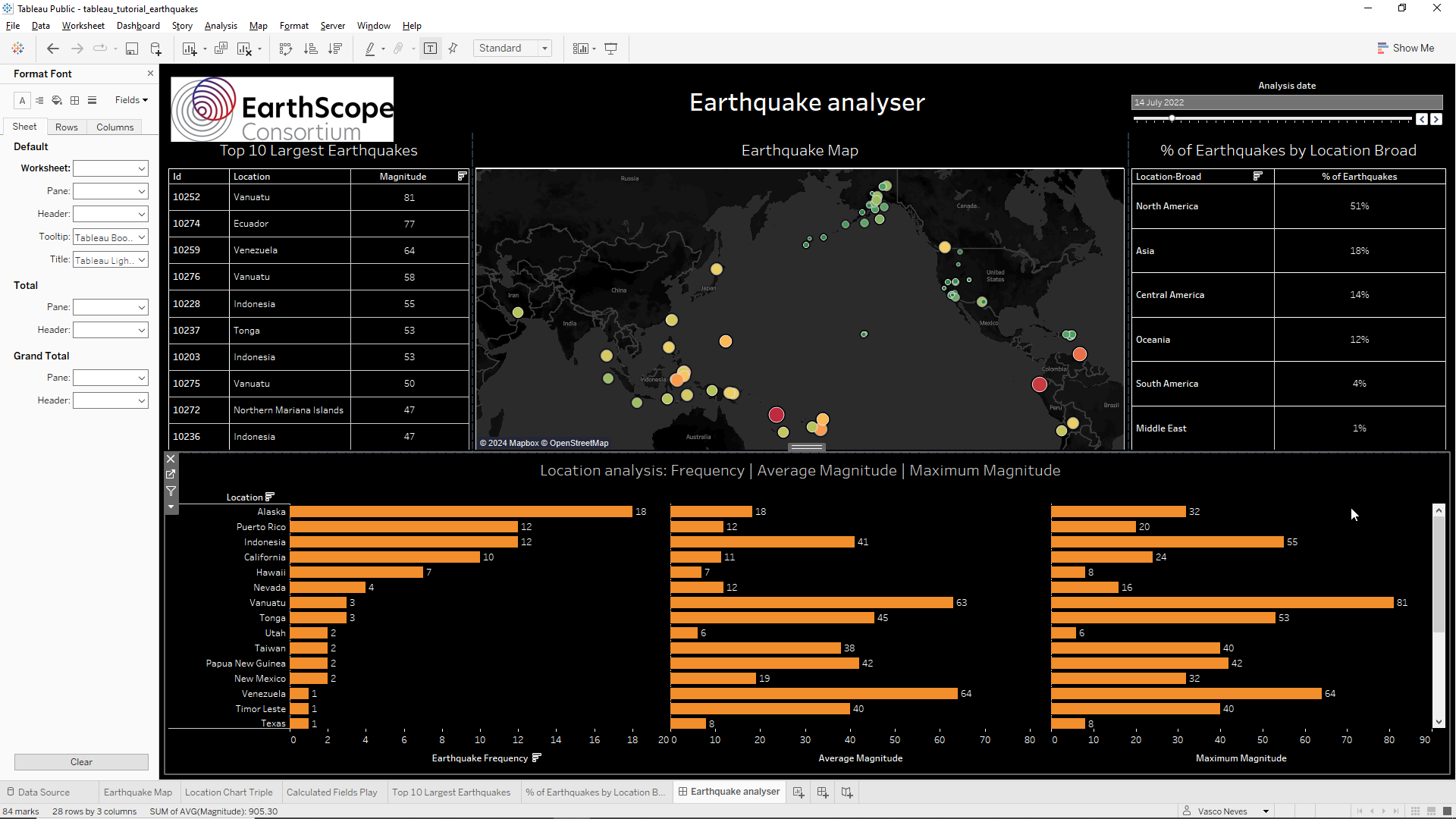
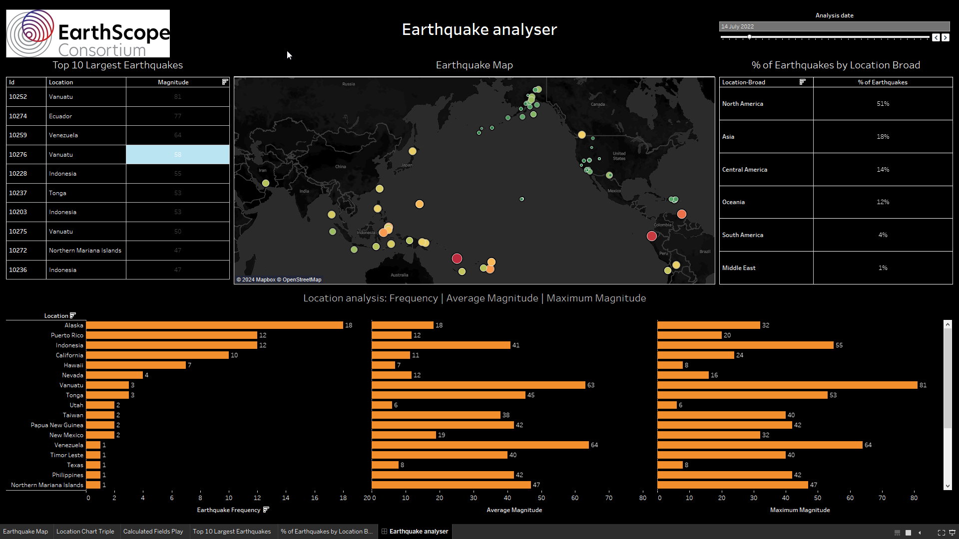
And that’s it we are finished! I think our client will be most pleased! The final final results looks like the one shown below. To interact directly with this dashboard we just need to go to my Public Tableau Repository.
| Top image sourced from: | 1755 Lisbon Earthquake wikipedia page |